Microarrays
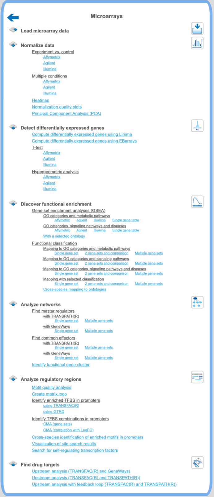
Normalize data
Experiment vs. control or multiple conditions
If your expression data haven’t been normalized yet, as we assume in this example, you have to go now to the second group of options, “Normalize data”. Make your choice according to the experimental platform you have used (Affymetrix, Agilent or Illumina). The next form will ask you to define the data file(s). For this, you have two options:
When you click in either field, a window with the title “Select data element” opens allowing you to select a file or, more likely at this step, a number of files by mouse click or by typing their names. Selection by mouse click works as usual for a range of files (keep the Shift key pressed when selecting the last file of the range), or for a number of distinct files (keep the Ctrl key pressed when selecting the second and further files from the list).
Make sure that all hybridizations (i.e., all CEL files) of your experiment are included into one normalization procedure. It should comprise all CEL files, including all multiple repetitions, of all conditions to be compared with each other at a later step, i.e. all tests and controls, at least those that you want to compare later on.
If your readings were from a dual-channel experiment, please tick the checkbox (Agilent only).
In the field Output name, you find a suggested name for the output file. The default name is “Normalized (<Normalization_method>)”, which you can edit (just click into this field and change the default name). An accordingly named file will appear in the Tree Area after the procedure runs successfully.
You may also have noticed that some further information about the analyses to be employed is displayed in both the Info Box as well as in the Operations Field (“My description” tab). Sometimes, they are identical by default, but in the latter field, you can edit the contents and add your own comments.
Now launch the normalization routine by pressing the [Run] button. The program will now normalize all your data across all experiments done, i.e. through all CEL files selected. The results will be stored in two different tables, one with the experimental, the other with the control values.
To have a closer look into the full content of one of the results tables, just click with the right mouse button onto the respective file name in the Tree Area, and choose “Open table” from the little menu that appears, or double-click on the file name. The table will open under a new tab in the Work Space. It should look like this, with the probeset IDs in the first and the normalized expression values from the different CEL files in the following columns, each hybridization being represented in one column (picture below).
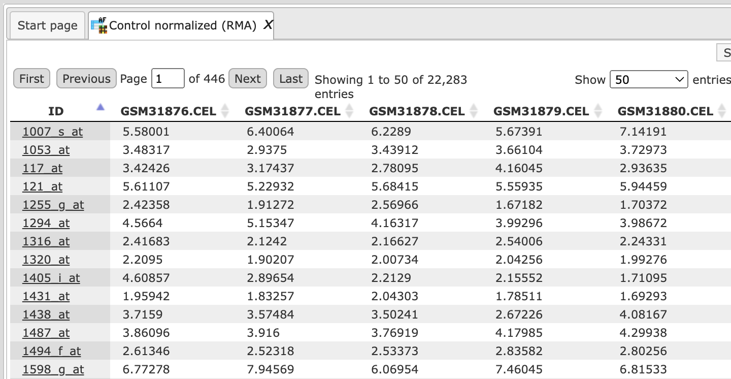
Important note. In the geneXplain platform, the probeset IDs are mapped to genes based on the Ensembl database. If some of the probeset IDs are not annotated in Ensembl, they cannot be mapped to genes and cannot be used for further analysis. That means, you can normalize data and calculate differentially expressed probes. These steps can be done on the probeset ID level, before conversion to genes. The step of converting probeset IDs into genes is depending on the annotation provided by the Ensembl database.
Heatmap
This tool creates a heatmap for the numerical data matrix provided with the input data table. The heatmap is limited to input tables with at most 5000 input rows. It is a graphical representation of data where the individual values contained in a matrix are represented as colors. The output folder contains a TIFF image of the heatmap as well as the ordered lists of row ids (e.g. RNA or gene ids) and column ids. The output tables can be used to extract subsets of correlated rows or columns revealed by the hierarchical clustering and/or the heatmap presentation.
Step 1: Open the workflow input form from the Start page. It will open in the main Work Space and looks as shown below:
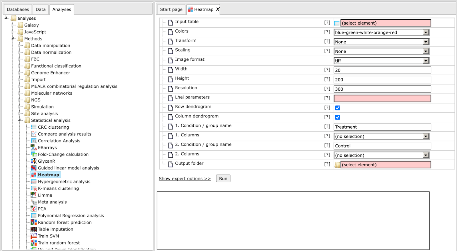
Step 2: Specify the Input table with e.g. normalized data for different experimental conditions. To specify the input table, you can drag & drop it from your project within the tree area.
Step 3: Specify the Transformation to be applied to data values from the drop-down menu. Possible transformations are Log or Rank; the default is None.
Step 4: Select Width and Height as well the Resolution of the output image.
Step 5: Specify layout heights (Lhei). This should be a list of 2 (when no column groups are specified) or 3 (with column groups) float values separated by commas that adjust the heights of the layout parts. Please refer to the documentation of R’s heatmap.2 {gplots} tool for details.
Step 6: Please check Row dendrogram and/or Column dendrogram if you want to have a raw dendrogram and/or a dendrogram with column in the output image.
Step 7: Specify the conditions/groups names for up to five groups (expert level).
Step 8: Specify the conditions/groups. They are shown as columns of the input table. You can select the column names for each condition/group via the drop-down menu.
Step 9: Define where the folder with the results should be located in your project tree. You can do so by clicking on the pink field “select element” in the field Output folder, and a new window will open, where you can select the location of the results folder and define its name.
Start the method by pressing the [Run workflow] button.
Output are two tables (heatmap_columns and heatmap_genes) and one image file in .tiff format. This image file needs to be downloaded and can be used in any graphical program/presentation.

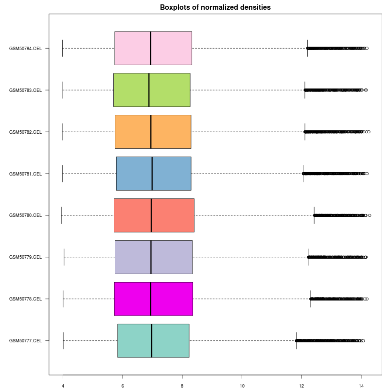
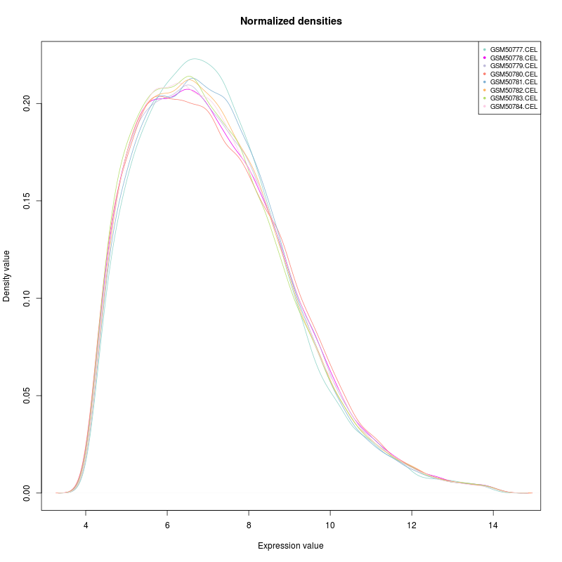
Normalization quality plots
This tool can be applied to plot densities of columns of a data table. As its name implies the intended use case is to inspect the quality of results of normalization as conducted in microarray experiments.
Example outputs, a box plot and a density plot, are shown at the end of this section. Colors were automatically assigned to selected columns.
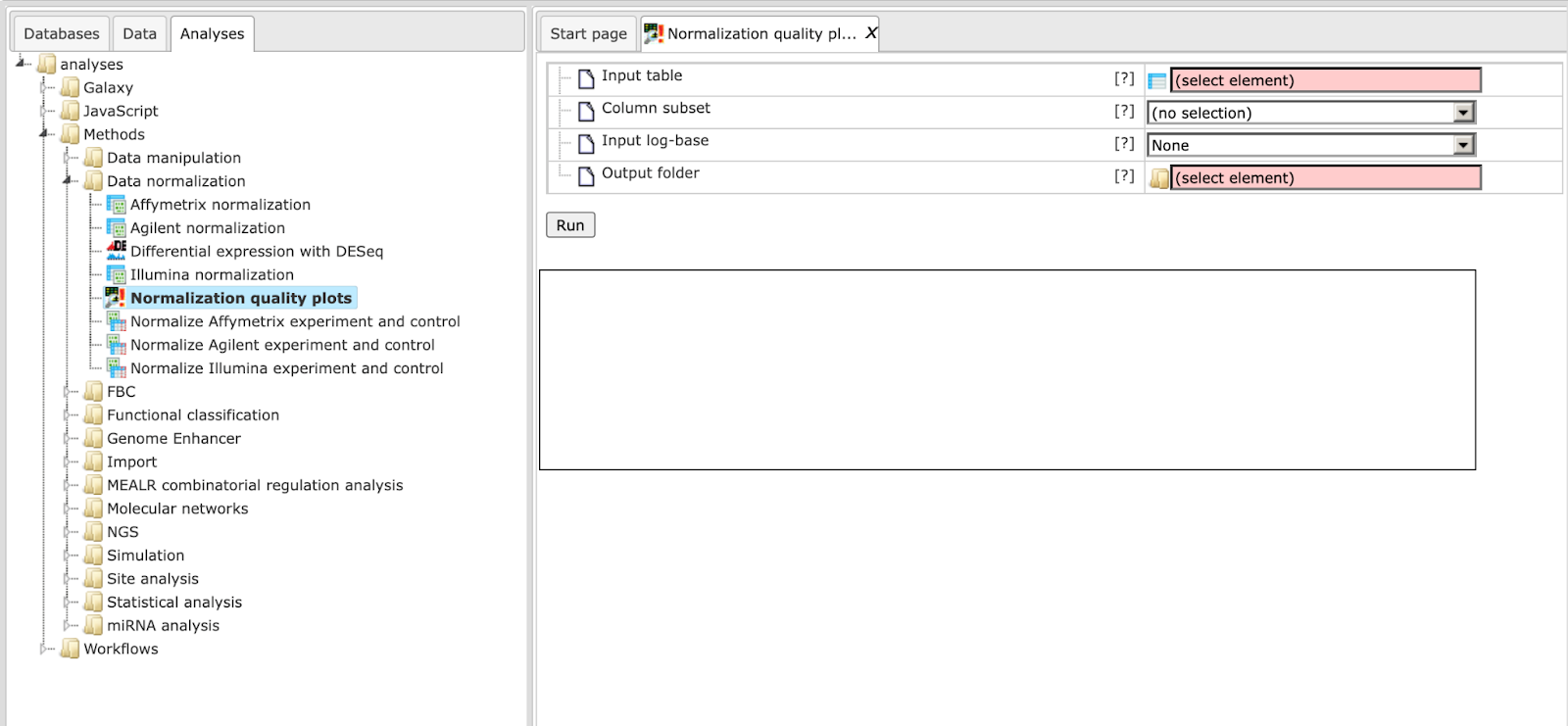
The input parameters are described in the following.
Input table: This table contains the numerical columns to analyze.
Column subset: Here you can select the set of columns to show in plots.
Input log-base: Densities and box plots will be computed for data on the log2 scale. Here you can specify the actual scale of the input data. If the log-base is log2, the tool will use the data values as is.
Output folder: The output folder will contain a density plot and a box plot for the specified columns.
Principal Component Analysis (PCA)
PCA is a statistical method that transforms data in a way, so that a maximum amount of variance within the data can be expressed in fewer or, at most, as many dimensions as the original data. The new dimensions onto which data are projected are the principal components. They capture the original variance in decreasing order, so that the first principal component presents most of the variance. PCA is often used to reduce the complexity of (to compress) or to identify groups in high-dimensional data.
This tool applies PCA to a table of numerical data, e.g. to normalized microarray measurements. For visualization purposes one can assign columns to one of up to five groups, which will be differentially colored in the generated output (scatter plot).
The output is stored in a specified folder and consists of three files. The PCA Scatter plot shows the items of specified groups at their transformed coordinates according to the first two principal components. The entire set of coordinates is available in PCA Transformed coordinates. Finally, the table PCA Component importance provides information about the relative importance of each principal component with respect to the proportion of explained variance.
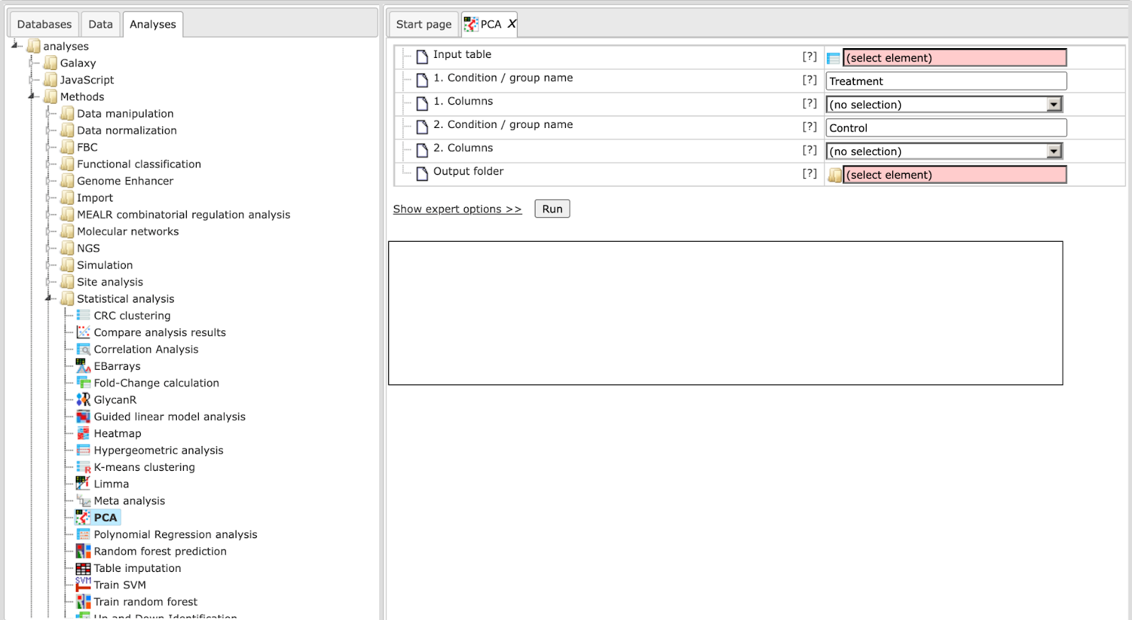
The input parameters for PCA are described in the following.
Input table: This table contains the numerical columns to analyze.
1-5. Condition / group name: One can specify up to five groups of columns. These fields contain the names that will be shown in outputs. Please note that unnamed groups are not considered, a name is not assigned automatically.
1-5. Columns: These fields contain the selected columns. Please note that column selections are not considered without a corresponding name. Columns can only be specified once.
Output folder: The output folder will contain the described output files.
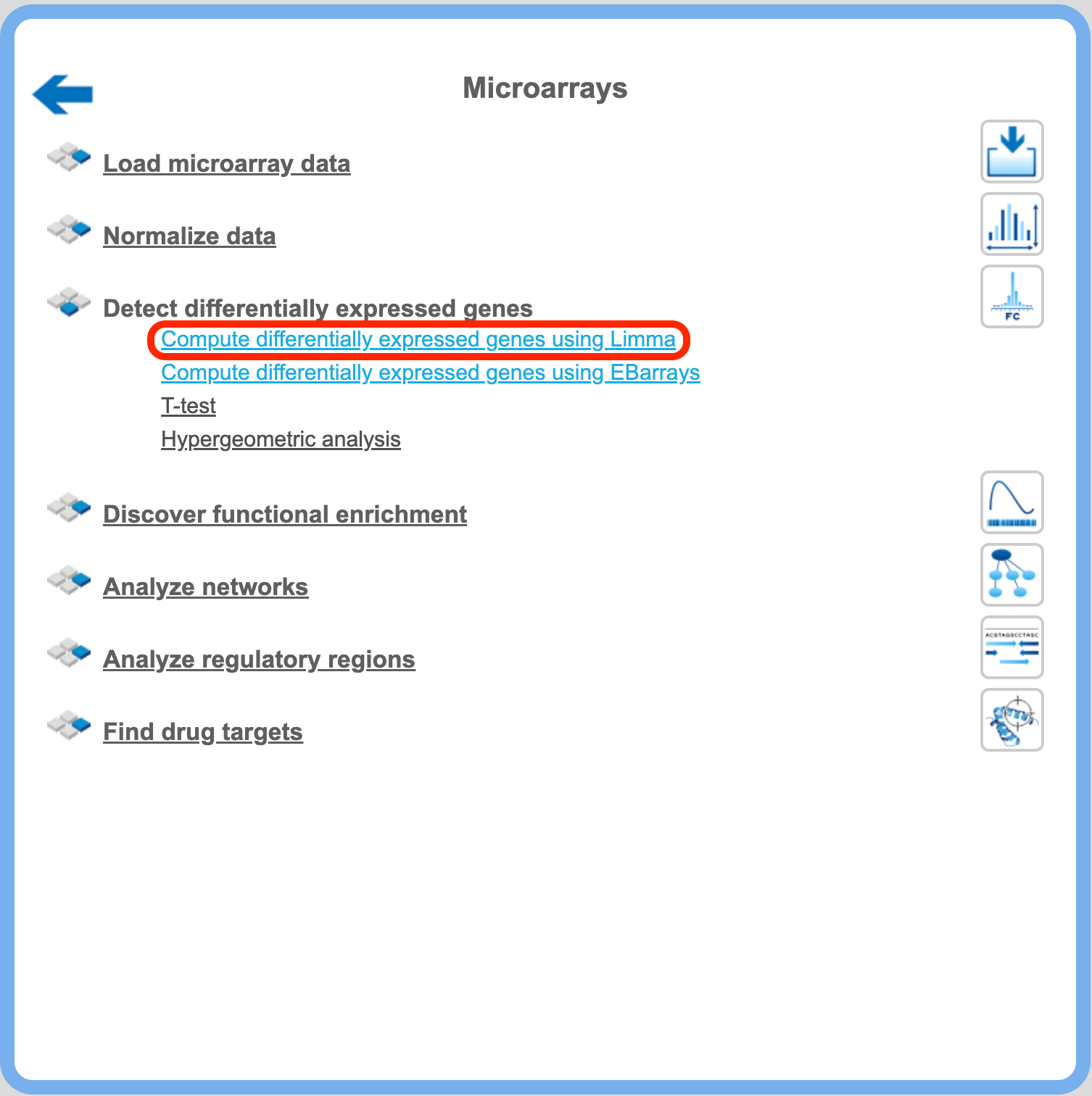
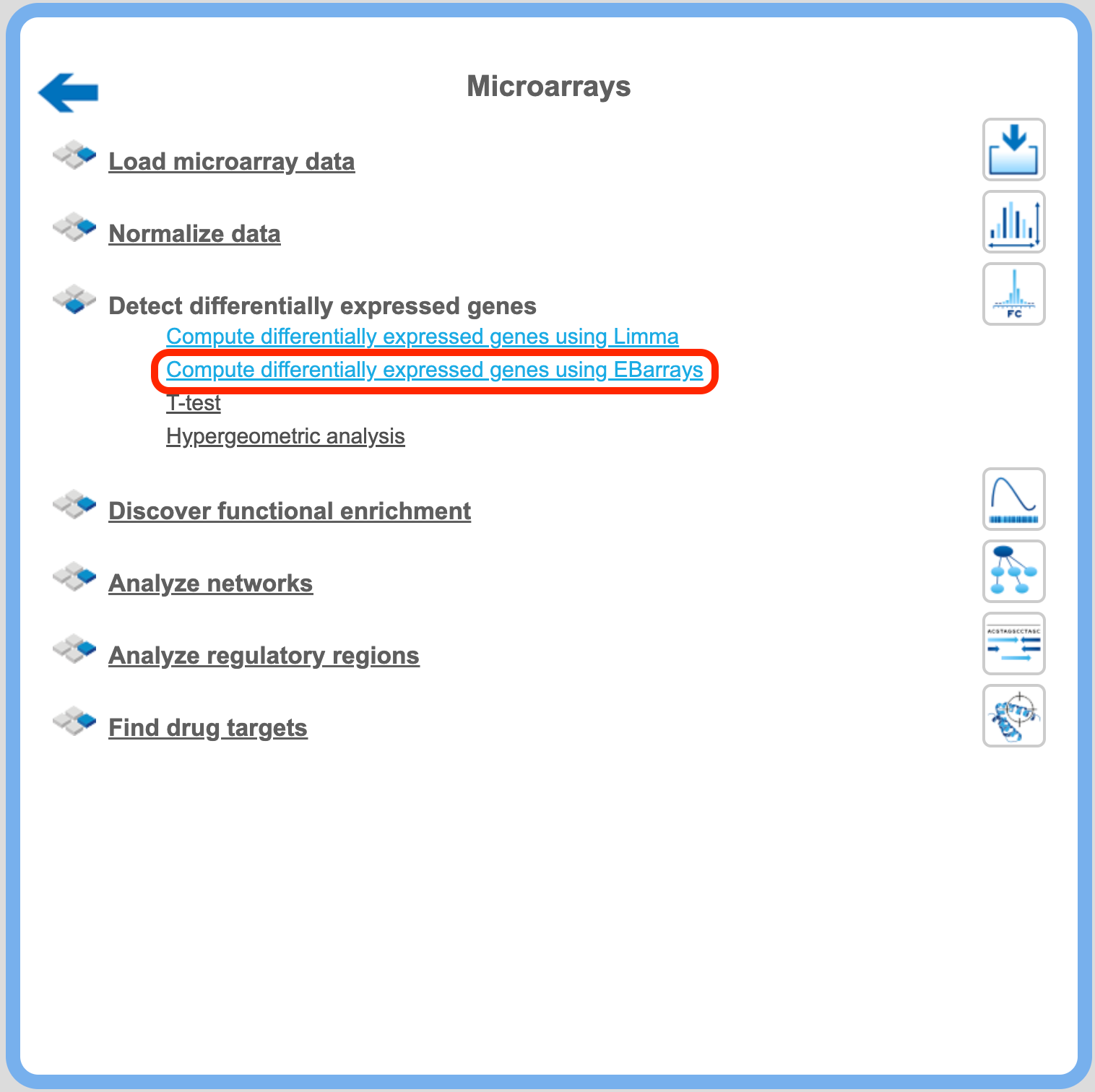
Detect differentially expressed genes
After the microarray results are normalized, the next step is to compute differentially expressed genes (DEG).There are four different statistical methods provided for DEG calculation in the platform: T-test, hypergeometric analysis, Limma, and EBarrays. For DEG calculation by T-test and hypergeometric analysis, there are predefined workflows, which take as input two tables with the normalized data, for two different conditions, referred to as Experiment normalized and Control normalized. The methods Limma and EBarrays require one input table with all the conditions, and you can specify up to five different conditions for one run of each of these two methods.
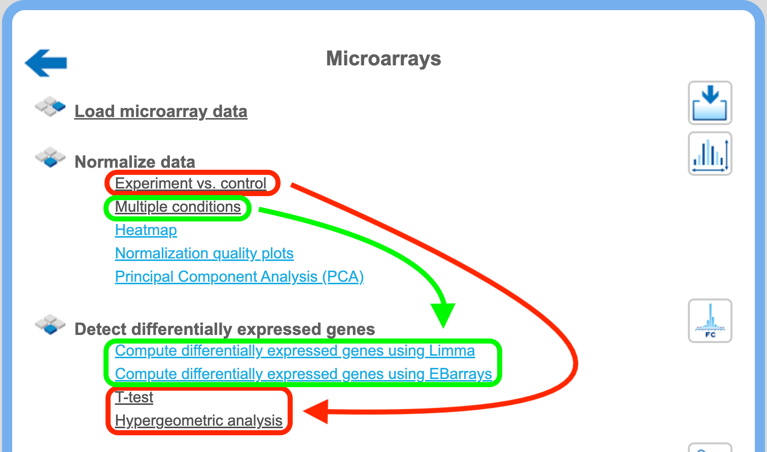
If you applied the normalization method “Experiment vs. control”, you can detect DEGs applying T-test and/or hypergeometric analysis to the workflows, highlighted in green in the picture above. If you applied the normalization method “Multiple conditions”, you can detect DEGs with Limma and/or EBarrays, highlighted in red.
In this chapter, the predefined workflows for DEG calculation with T-test and with hypergeometric analysis are described in detail.
Detect differentially expressed genes with T-test
This workflow is designed to find the set of up-regulated and down-regulated genes applying Student’s T-test. There are three workflows designed for different experimental platforms (Affymetrix, Agilent and Illumina).
In the first step p-values for normalized files are calculated for all probes using the “Up and Down Identification” analysis. This analysis applies Student’s T-test for p-value calculation, thus the number of data points should be at least three for each experiment and control.
To launch the workflow, follow these steps:
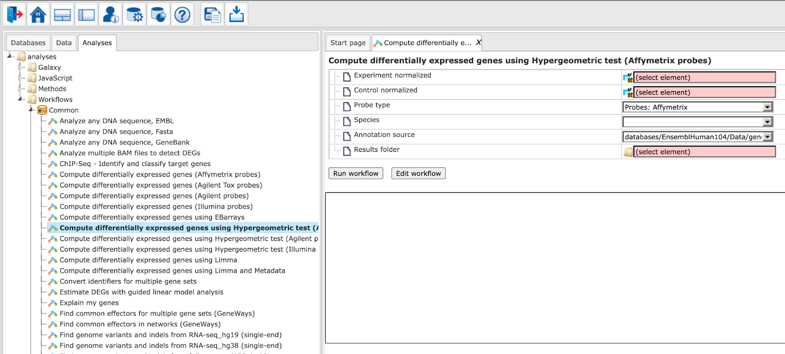
Step1. Open the workflow input form from the Start page. It looks as shown below:
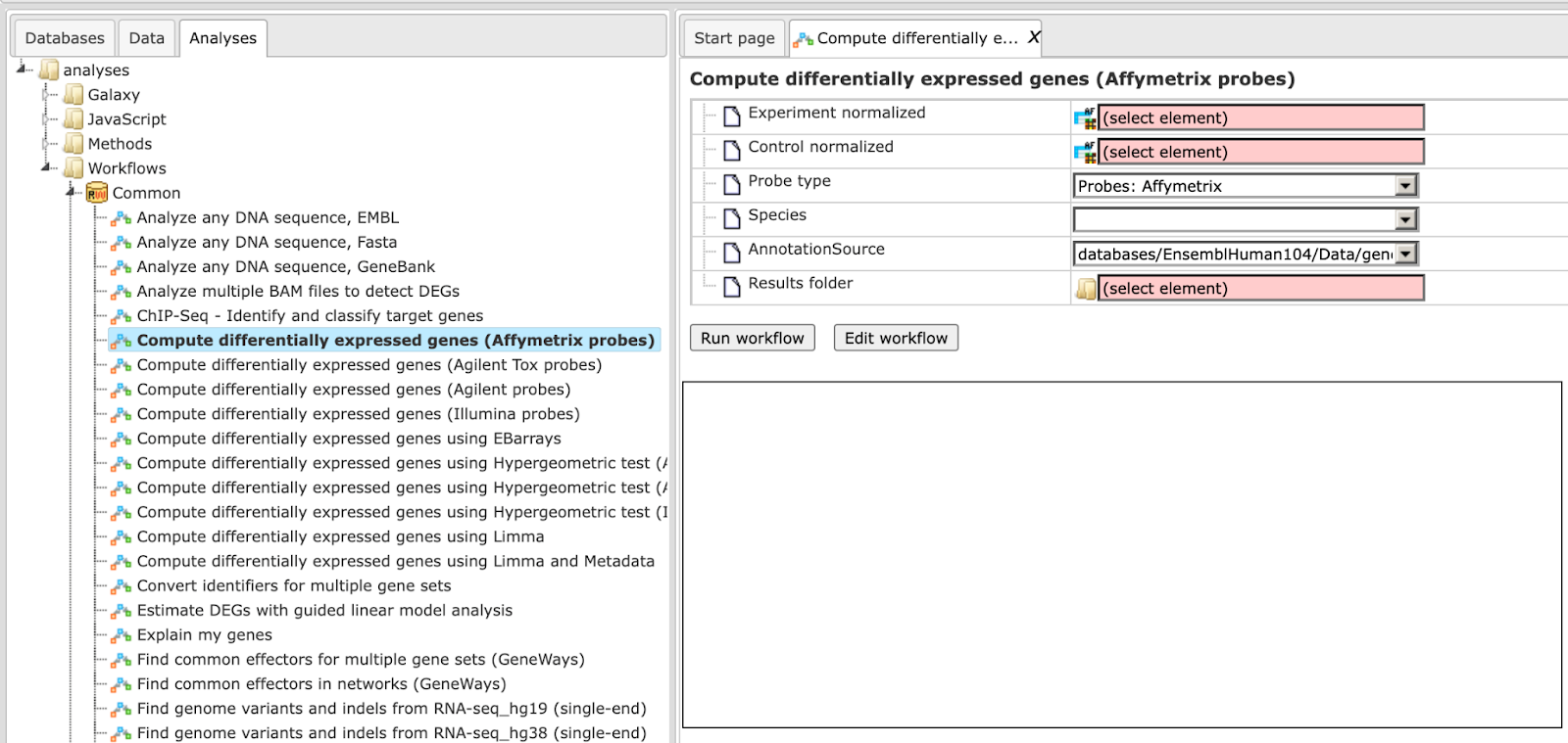
Step 2. Specify the tables with normalized data in the fields Experiment normalized and Control normalized. You can drag it from your project within the tree area and drop it in the pink box of the fields. Alternatively, you may click on the pink field (select element) and a new window will be opened, where you can select the input tables.
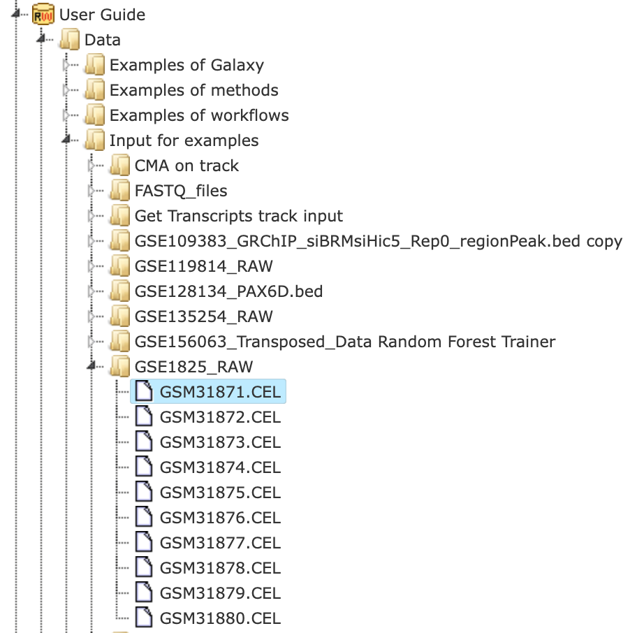
The further steps are demonstrated using the Affymetrix files found here:
Step 3. Specify the biological species of the input sets in the field Species by selecting the required biological species from the drop-down menu.
Step 4. Define where the folder with the results should be located in the tree. You can do so by clicking on the pink field (select element) in the field Results folder, and a new window will be opened, where you can select the location of the results folder and define its name.
After entering all input fields press [Run workflow] and wait till the workflow is completed.
The output is a folder with several files as shown below:
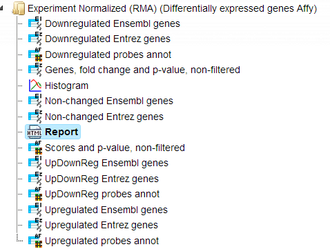
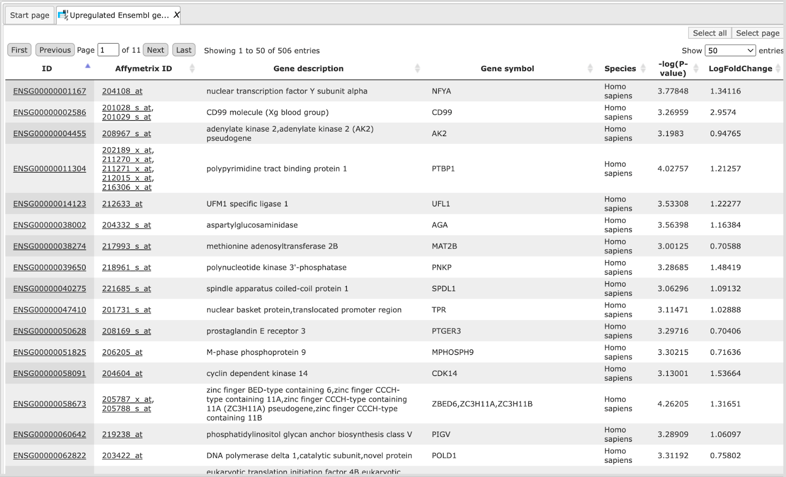
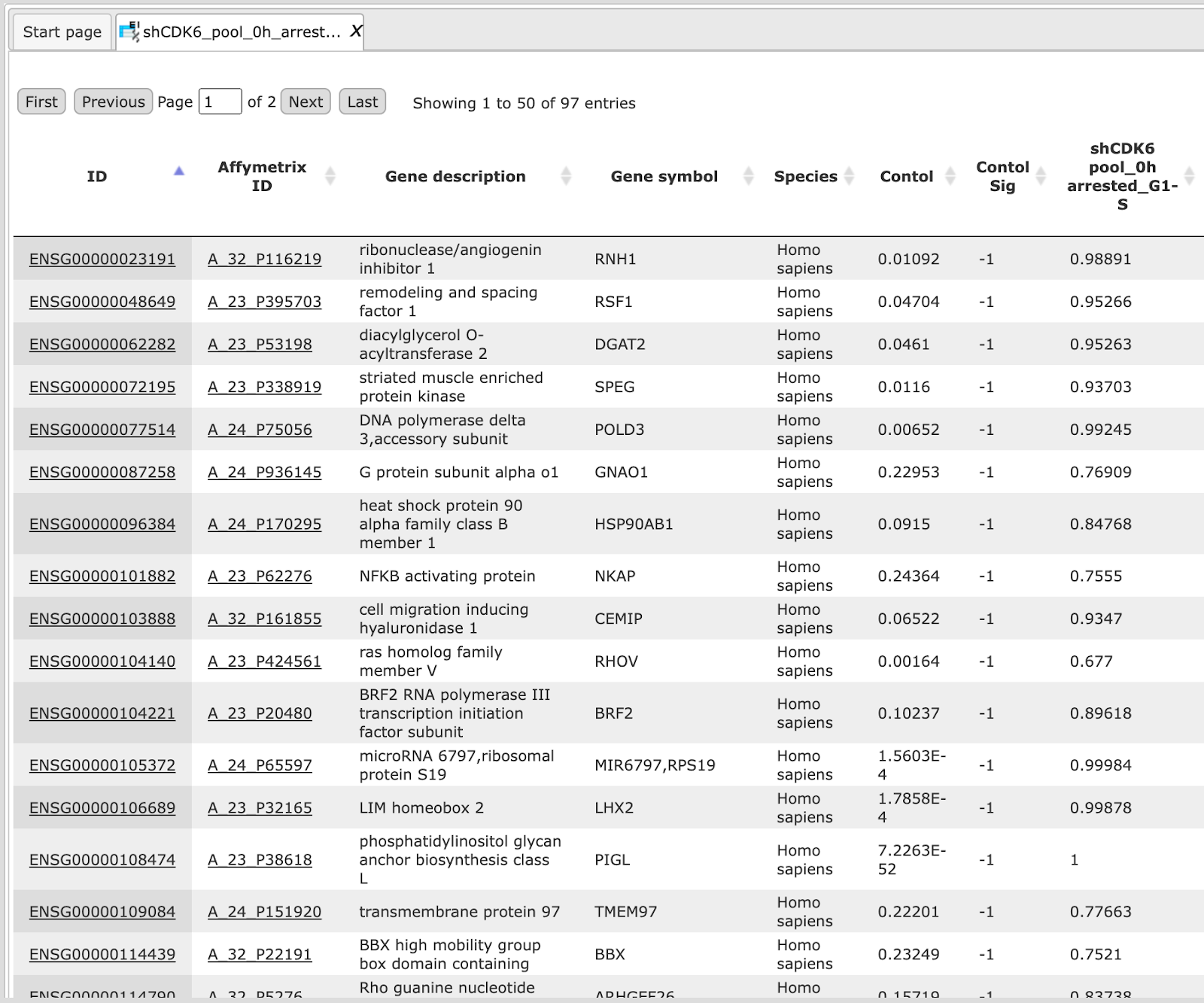
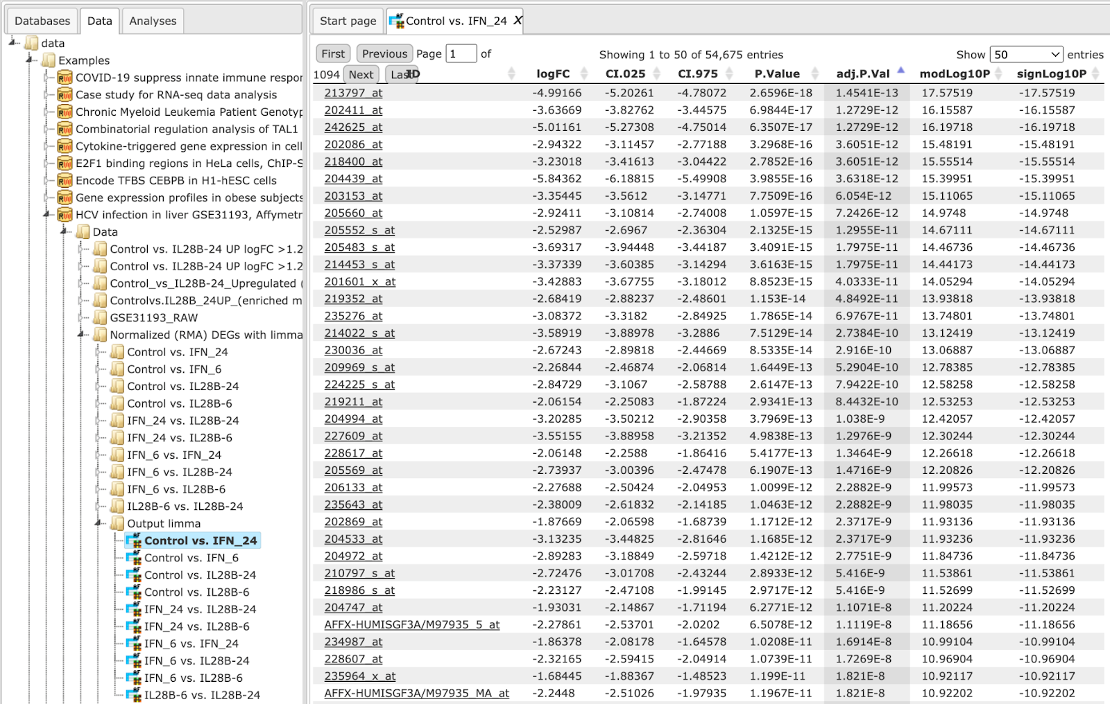
The table Genes, fold change and P-value, non-filtered. This table contains all genes with LogFoldChange and p-value calculated; each row corresponds to one gene.
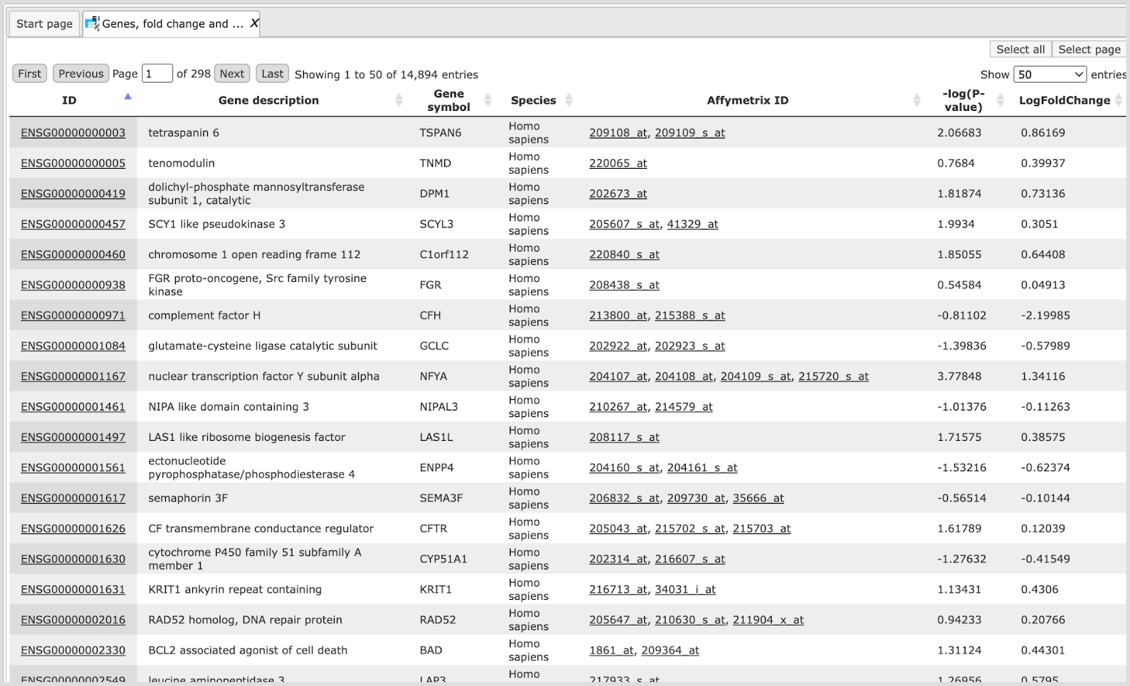
The columns ID, Gene description and Gene symbol present Entrez identifiers for the genes, a full name for each gene, and a standard gene symbol, respectively. The column Species shows the corresponding taxonomic species. The column AffymetrixID contains the probe set IDs corresponding to each gene, and you can sometimes see more than one Affymetrix probe corresponding to one gene. The column LogFoldChange shows the base 2 logarithm of the ratio between expression value in experiment vs. control. The column –log(P-value) shows the negative base 10 logarithm of the p-value.
Please note that the column –log(P-value), according to a widely accepted convention, has algebraic signs according to being up- (positive values) or down-regulated (negative values).
In the course of workflow progression, this table has been filtered by several conditions in parallel to identify up-regulated, down-regulated, and non-changed Affymetrix probeset IDs and genes.
The filtering criteria used are:
For up-regulated probes: LogFoldChange>0.5 and -log_P_value_>3
For down- regulated probes: LogFoldChange<-0.5 and -log_P_value_<-3
For non-changed genes : LogFoldChange<0.002 and LogFoldChange>-0.002
The table Upregulated Ensembl genes. You can find the number of the resulting up-regulated genes written on top of each output table (highlighted by the red circle):
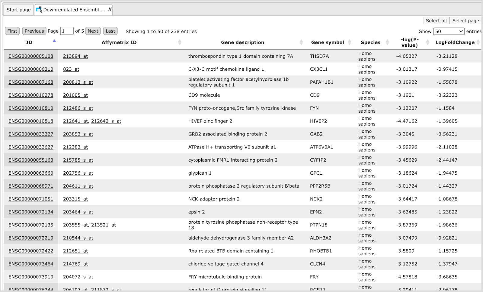
The table Downregulated Ensembl genes. The structure and the meaning of the columns in the tables are the same as in the Upregulated Ensembl genes table.
The table Non-changed Ensembl genes.
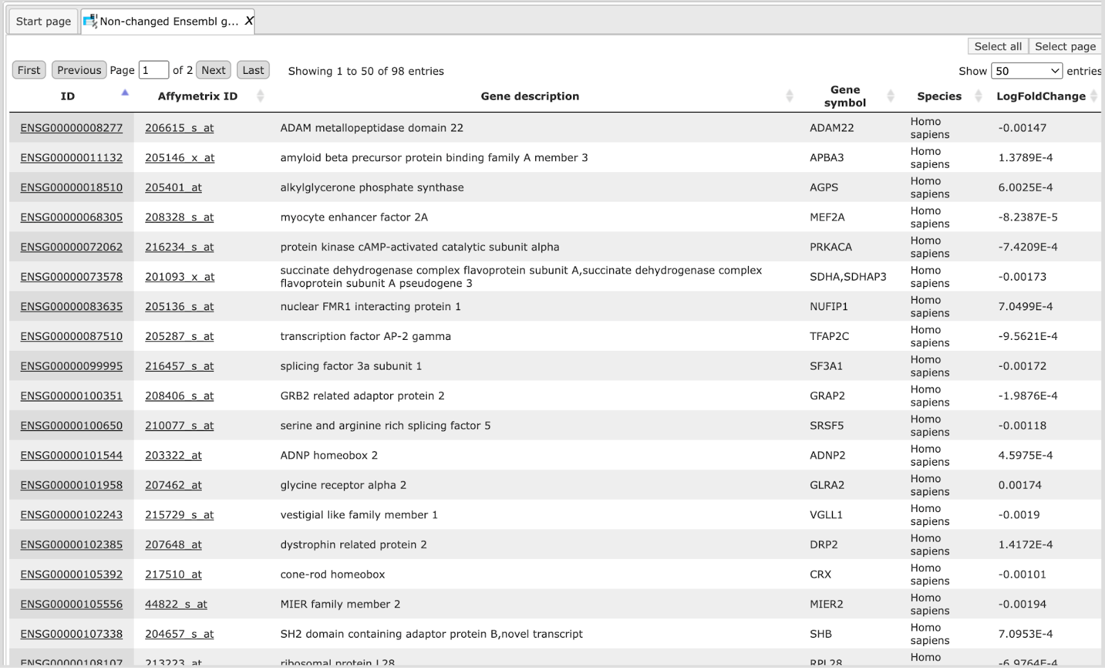
In this example the number of up-regulated, down-regulated and non-changed genes are 503, 241, and 99, respectively.
These individual output files can be used further as input for running other workflows as described in the following sections.
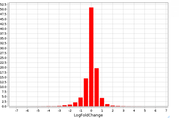
The plot ( ) contains a histogram of the log fold change distribution for all genes:
The Report. The workflow summarizes all results and automatically produces a report. In addition you can have a look at the list of both up-regulated and down-regulated genes.
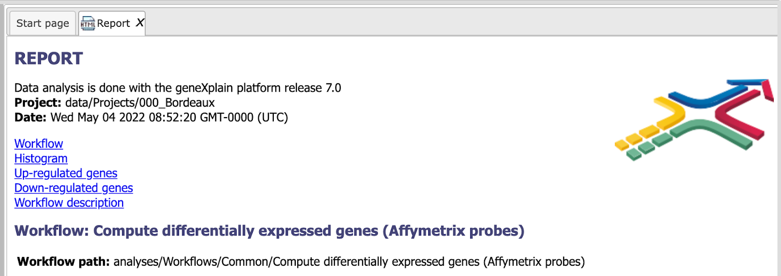 This report can be exported in html format.
Detect differentially expressed genes by hypergeometric analysis
This workflow is very similar to the workflow Detect differentially expressed genes by T-test. The principal difference is in the statistical method for calculation of the p-value. In this workflow, the p-value is calculated by hypergeometric analysis (Y.V.Kondrakhin, R.N.Sharipov, A.E.Kel, F.A.Kolpakov. (2008) Identification of Differentially Expressed Genes by Meta-Analysis of Microarray Data on Breast Cancer, In Silico Biology, 8: 383-411).
Tip If you have just two or even one data point in each experiment and control (e.g. one CEL file in experiment and one CEL file in control), you can apply hypergeometric analysis to calculate DEGs. In contrast to the T-test which requires at least three data points, hypergeometric analysis can make calculations for two and even one data point in each normalized experiment and normalized control files. This allows to calculate DEGs to compare, for instance, one patient data set with one healthy data set.
The workflow input form looks as shown below:
The output folder and the structure of the individual tables, as well as the report, are similar to those described Detect differentially expressed genes through T-test.
Detect differentially expressed genes with Limma
This workflow is designed to find sets of up-regulated and down-regulated genes starting with the normalized table of your expression data. Please refer to the method description to know about LIMMA. This workflow is designed for different experimental platforms (Affymetrix, Agilent and Illumina).
In the first step this workflow computes the differential expression between up to five conditions / groups. Each group corresponds to one experimental condition (time point, treatment, cell type, etc.) or control. You can specify 2 to 5 conditions. An input table is a data table that contains several columns with normalized measurement values, e.g. from a normalized microarray experiment. All possible contrasts between groups are considered and their output is stored in a common folder. Conditions are compared in the specified order from first to fifth; e.g. for the given conditions named 1, 2 and 3, the output will contain the contrasts “Condition 1 versus Condition 2”, Condition 1 versus Condition 3” and “Condition 2 versus Condition 3”. ”. The workflow can be found on the Start page, under the button Microarrays, under the section “Detect differentially expressed genes”.
Step1. Open the workflow input form from the Start page. It looks as shown below:
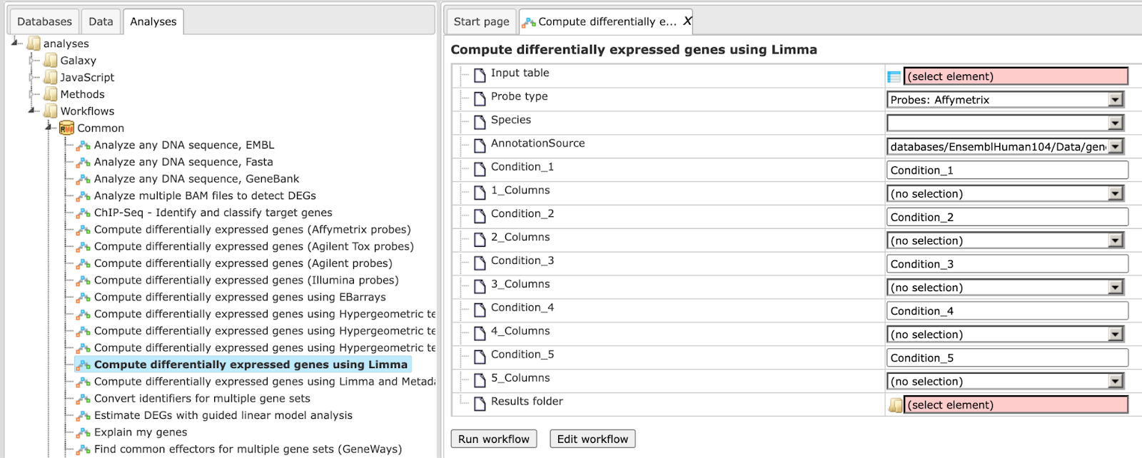
Step 2. Specify the table with normalized data in the field Input table. You can drag it from your project within the tree area and drop it in the pink box of the fields. Alternatively, you may click on the pink field (select element) and a new window will be opened, where you can select the input table.
For this example the input used can be found here: https://platform.genexplain.com/bioumlweb/#de=data/Examples/Cytokine-triggered%20gene%20expression%20in%20cell%20cycle%20stages%2C%20GSE52465%2C%20Agilent-014850%20microarray/Data/Agilent%20normalized
Step 3. Specify the biological species of the input table in the field Species by selecting it from the drop-down menu.
Step 4. Specify the conditions / groups. They are shown as columns of the input table. You can select the column names for each condition/group via the drop-down menu.
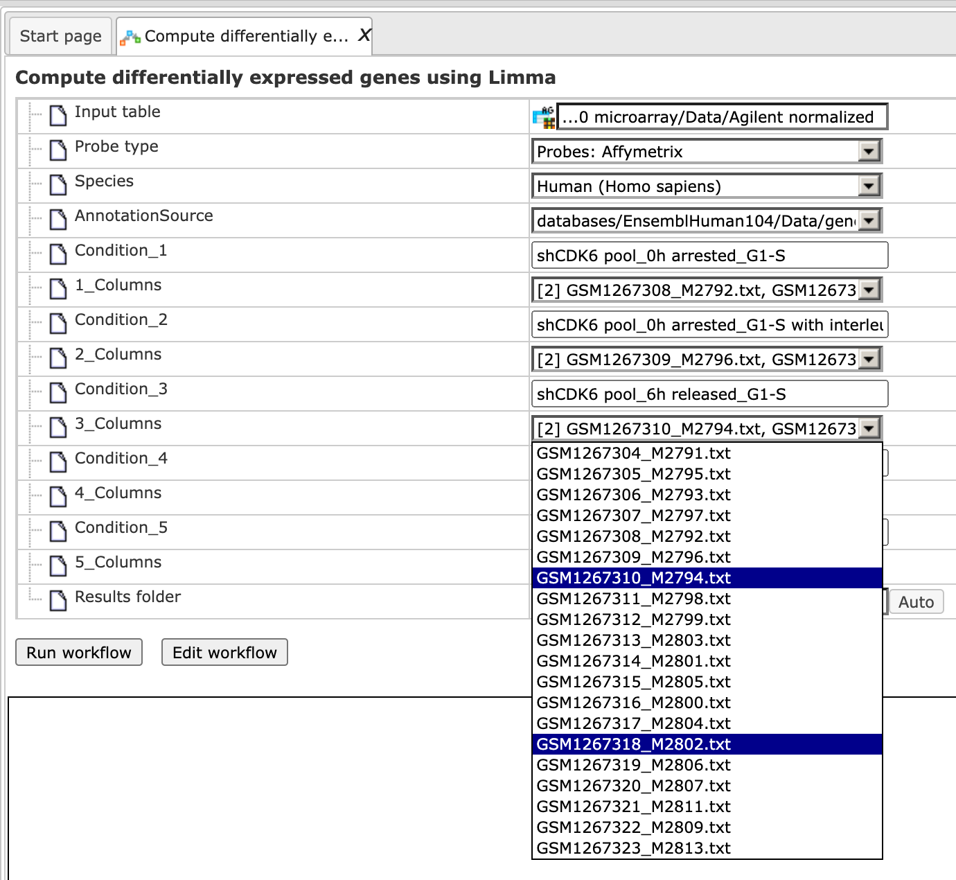
Step 5. Define where the folder with the results should be located in the tree. You can do so by clicking on the pink field (select element) in the field Results folder, and a new window will be opened, where you can select the location of the results folder and define its name.
After entering all input fields press [Run workflow] and wait till the workflow is completed. The output is a folder with 10 result folders (e.g. Condition_1 vs. Condition_2 for DEG calculation), a folder for each individual comparison (Output limma) and one Output plots folder, as shown below:
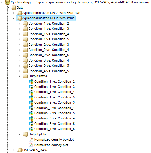
The Normalized density boxplot and the Normalized density plot in the folder Output plots show a quality control of the input normalized data table.
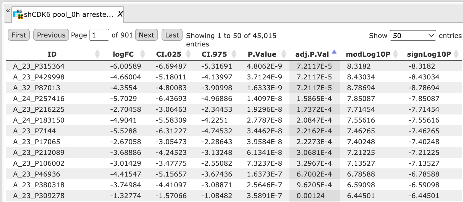
The tables in the folder Output limma are the output tables from the limma method, sorted via adjusted p-values.
The 10 output folders for each comparison e.g. Condition_1 vs. Condition_5 contain the results of the identified up-, down- and non-regulated Ensembl genes.
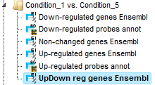
The table UpDown reg genes Ensembl in the Folder Condition_1 vs. Condition_5 contains all differentially expressed genes filtered by LogFoldChange and p-value for up- and down-regulated genes; each row corresponds to one gene.
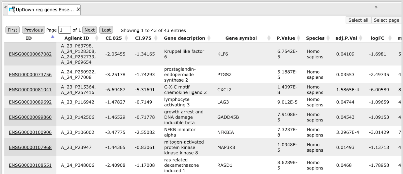
The columns ID, Gene description and Gene symbol represent Ensembl identifiers for the genes, a full name for each gene, and a standard gene symbol, respectively. The column Species shows the corresponding taxonomic species. The column AffymetrixID contains the probe set IDs corresponding to each gene, and you can sometimes see more than one Affymetrix probe corresponding to one gene. The column logFC shows the base 2 logarithm of the ratio between expression values in experiment vs. control. The column adj.P.Val shows the adjusted p-value (Benjamini-Hochberg).
In the course of workflow progression, this table has been filtered by several conditions in parallel to identify up-regulated, down-regulated, and non-changed probeset IDs that were then converted into Ensembl gene identifiers.
The filtering criteria used are:
For up-regulated genes: logFC >0.5 and adj.P.Val <0.05
For down- regulated genes: logFC <-0.5 and adj.P.Val <0.05
For non-changed genes :logFC <0.002 and logFC >-0.002
Detect differentially expressed genes with EBarrays
Similarly to the workflow described above, this workflow is designed to find the set of up-regulated and down-regulated genes starting with a normalized table of your expression data, but using a different statistical method, EBarrays. Please refer to method description for description of this method. This workflow is designed for different experimental platforms (Affymetrix, Agilent and Illumina).
In the first step the workflow computes the differential expression between up to five conditions/groups. Each group corresponds to one experimental condition (time point, treatment, cell type, etc.) or control. You can specify 2 to 5 conditions. An input table is a data table that contains normalized measurement values, e.g. from a normalized microarray experiment. All possible contrasts between groups are considered and their output is stored in a common folder. Conditions are compared in the specified order from first to fifth. E.g. given conditions named 1, 2 and 3, the output will contain the contrasts “Condition 1 versus Condition 2”, Condition 1 versus Condition 3” and “Condition 2 versus Condition 3”.
The workflow can be found on the Start page, under the button Microarrays, under the section “Detect differentially expressed genes”.
Step1. Open the workflow input form from the Start page. It looks as shown below:
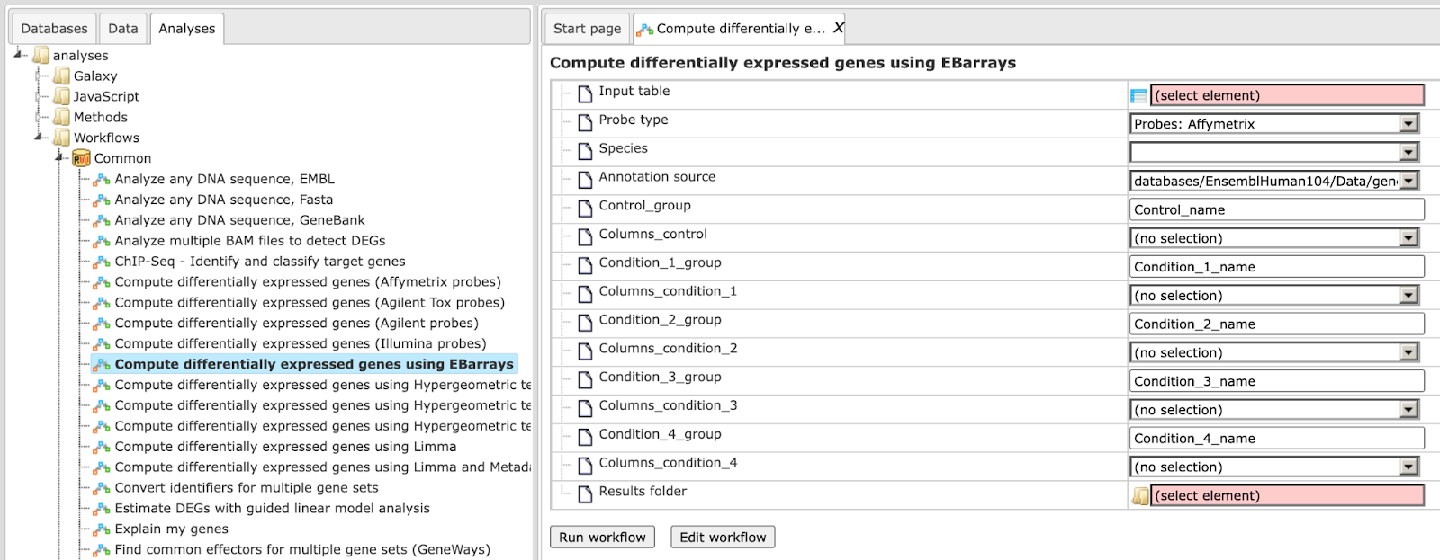
Step 2. Specify the table with normalized data in the field Input table. You can drag it from your project within the tree area and drop it in the pink box of the fields. Alternatively, you may click on the pink field (select element) and a new window will be opened, where you can select the input table.
Input used for this Example can be found here: https://platform.genexplain.com/bioumlweb/#de=data/Examples/Cytokine-triggered%20gene%20expression%20in%20cell%20cycle%20stages,%20GSE52465,%20Agilent-014850%20microarray/Data/GSE52465_RAW/Agilent%20normalized
Step 3. Specify the biological species of the input table in the field Species by selecting it from the drop-down menu.
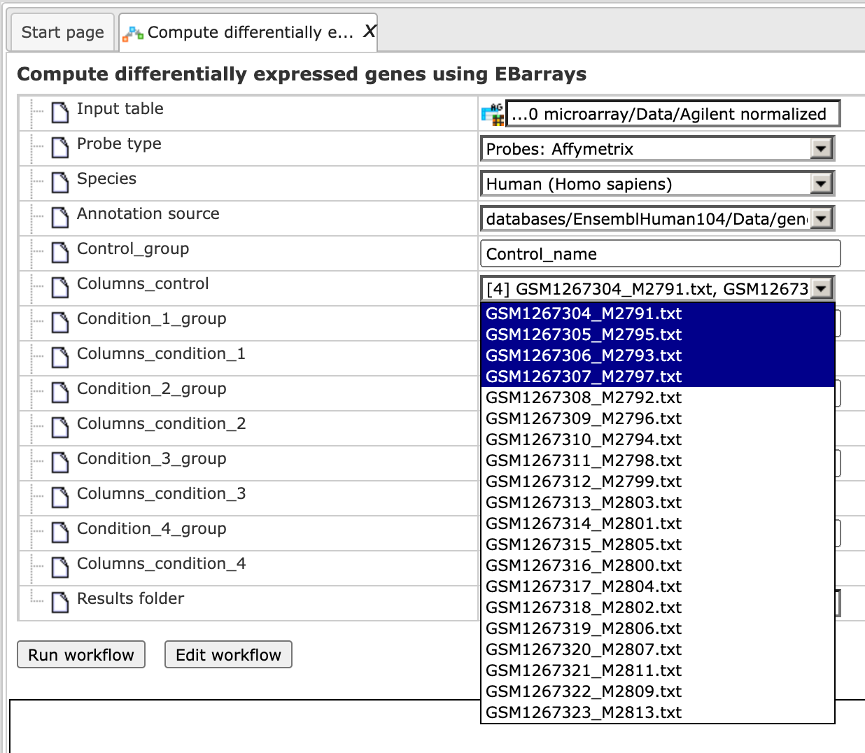
Step 4. Specify the conditions/groups of the input table. You can select the column names for each condition/group via the drop-down menu.
Step 5. Define where the folder with the results should be located in the tree. You can do so by clicking on the pink field (select element) in the field Results folder, and a new window will be opened, where you can select the location of the results folder and define its name.
After entering all input fields press [Run workflow] and wait till the workflow is completed.
The output is a folder with several result folders and files as shown below:
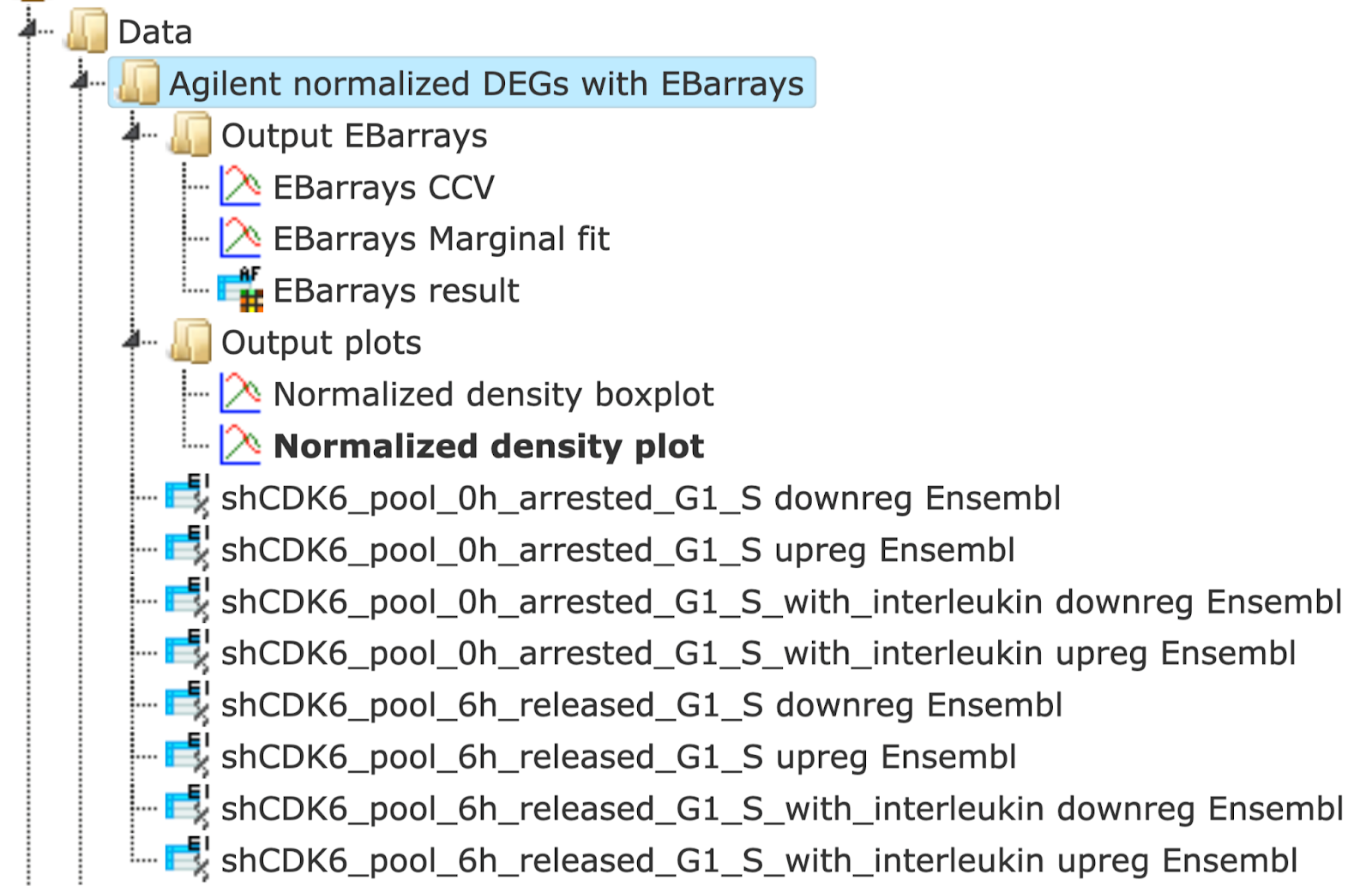
The Normalized density boxplot and the Normalized density plot in the folder Output plots show a quality control of the input normalized data table.
The table EBarrays result and two plots in the folder Output EBarrays are the output table and plots from the EBarrays method.
The tables for each condition (except control) e.g. Condition_2 downreg Ensembl and Condition_2 upreg Ensembl contain all differentially expressed genes with filtered LogFoldChange and p-value for up- and down-regulated genes; each row corresponds to one gene.
The columns ID, Gene description and Gene symbol present Ensembl identifiers for the genes, a full name for each gene, and a standard gene symbol, respectively. The column Species shows the corresponding taxonomic species. The column Agilent ID contains the probe set IDs corresponding to each gene, and you can sometimes see more than one Affymetrix probe corresponding to one gene. The direction of differential expression can be derived from the fold change column e.g. Condition_2 FC, which contains the log2-fold changes. The EBarrays method estimates a critical posterior probability cutoff for the given FDR level on the basis of the fitted mixture model. Probes / genes exceeding this cutoff in some treatments are indicated by a value of 1 (instead of -1) in the output column named e.g. Condition_2 Sig.
In the course of workflow progression, this table has been filtered by several conditions in parallel to identify up-regulated and down-regulated genes.
The filtering criteria used are:
For up-regulated genes: Condition_x FC >0.5 and Condition_x Sig = 1
For down- regulated genes: Condition_x FC <-0.5 and Condition_x Sig = 1
In the folder Output plots there are two diagnostic plots named EBarrays CCV and EBarrays Marginal fit. These plots enable a judgment about whether the assumptions of the approach hold and how well the fitted model represents the data (please refer to the documentation of the EBarrays Bioconductor package for further details).
Note. In the input field Condition 1 always the control condition should be specified. Each of the input conditions 2, 3, 4, and 5 are compared with condition 1.
Discover functional enrichment
This set of workflows helps to identify certain functional groups in your input list of genes or proteins, namely those that are particularly affected in a statistically significant manner.
The first approach to do this is the Gene Set Enrichment Analysis (GSEA). Applying this method to genes/protein in focus, the workflows will find out whether any category of Gene Ontology (GO), Reactome pathways, TRANSPATH® pathways or HumanPSD™ disease terms are statistically overrepresented among them, and if so, whether this overrepresentation is valid for the up- or down-regulated genes if expression values are present in your input table.
An alternative approach to GSEA is Functional classification, or mapping to ontologies. As input, you can use a table of genes/proteins. The difference of this option to GSEA is that no enrichment of the categories is calculated, but that all genes in the list are mapped to GO categories or other ontologies. For example, you can use tables with up-regulated or down-regulated genes coming from the previous analysis steps of microarray or RNA-seq experiments, or proteins identified in proteomics experiments, the lists of genes located nearby of ChIP_seq peaks, etc.
Gene Set Enrichment Analysis (GSEA)
There are two types of workflows, depending on the format of the input tables. You can start the GSEA with the normalized microarray tables, before calculating DEGs. The program first computes fold changes, which are then used to dynamically detect functional groups of genes that are differentially affected by the experimental conditions.
Alternatively, you can start the GSEA with any gene or protein table having a numerical column that can be used for enrichment calculations, e.g. expression fold change after calculating DEGs.
GSEA by GO categories and metabolic pathways
Gene set enrichment analysis (GSEA) with GO categories or with metabolic pathway annotation in REACTOME can be done by either starting from raw data of any of the widely used experimental platforms (Affymetrix, Agilent, or Illumina), or from a single gene table that you may have composed yourself.
Affymetrix, Agilent, or Illumina data sets
The three workflows under this category are designed to perform the GSEA by the three branches of Gene Ontology, biological process, molecular function and cellular component as well as by the Reactome pathways:
Gene Set Enrichment Analysis (Affymetrix probes),
Gene Set Enrichment Analysis (Agilent probes),
Gene Set Enrichment Analysis (Illumina probes).
Each of the three workflows differs in the format of the input data, for Affymetrix, Agilent or Illumina microarray platforms, respectively. The analysis performed by these workflows and the interpretation of the results are the same. As an example, let’s consider an Affymetrix-specific workflow.
To launch the workflow, follow these steps:
Step 1 Open the workflow input form from the Start page. It opens in the main Work Space and looks as shown below:
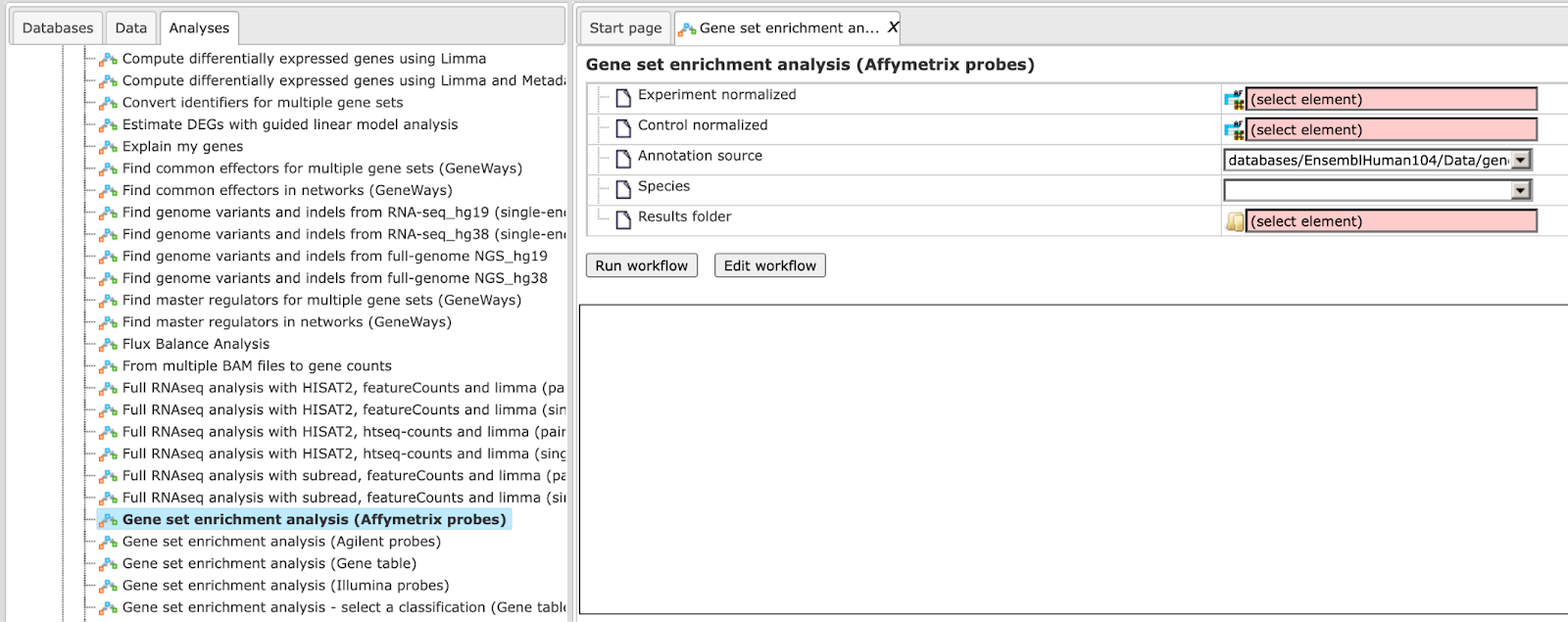
Step 2 Input the Experiment normalized and Control normalized tables from the tree. You can either drag-and-drop or click on the select element box to specify the tables in the Tree area. Here, the tables from the Example folder/ HCV infection in liver GSE31193, Affymetrix U133 Plus 2.0 are used. We aim to find out the enriched functional categories of gene expression upon treatment with IFN type III after 24 hours versus non-treated cells. Below are the links to the input files:
It is important to note that for this workflow, the input tables should have
Affymetrix probeset IDs in the ID column. Such tables have an ( ) icon in the tree area and look like:
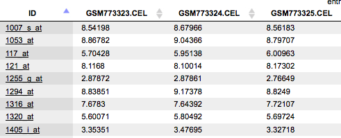
You can see Affymetrix probeset IDs in the ID column, and several columns with the normalized values; each column corresponds to one CEL file.
Step 3 Choose human, mouse, or rat species from the drop-down menu.
Step 4 Specify location and name of the Results folder. Important: the results folder should be located in your Project in the tree.
Step 5 Press the button [Run workflow] and wait till the workflow is completed.
Results
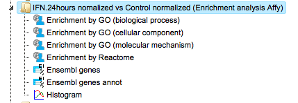
The results folder contains four tables with the results of the enrichment analysis divided by the three branches of Gene Ontology, biological process, molecular function and cellular component, as well as by the Reactome pathways. Path to the current output folder is:
data/Examples/HCV infection in liver GSE31193, Affymetrix U133 Plus 2.0 microarray/Data/Experiment normalized (RMA) vs Control normalized (RMA) (Enrichment analysis Affy)
The tables with the enriched categories look like:
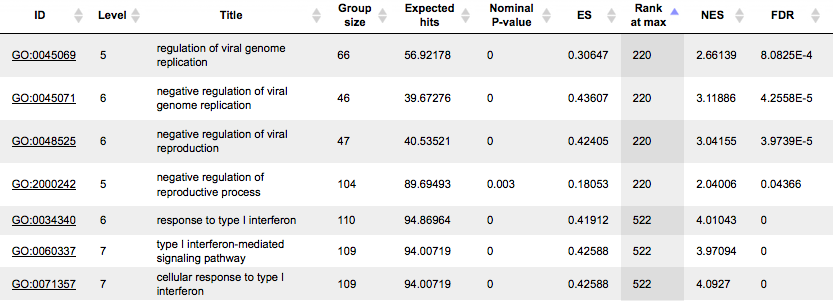
The GSEA results are described in details in a separate section below.
The table Ensembl genes annot contains Ensembl genes as a result of Affymetrix IDs convertion into Ensembl gene IDs:
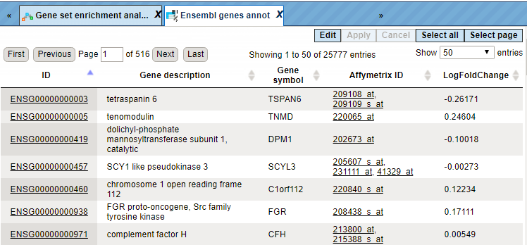
For each gene, gene symbol, gene description, and Affymetrix probeset ID are shown. Additionally, the LogFoldChange value is calculated for each gene.
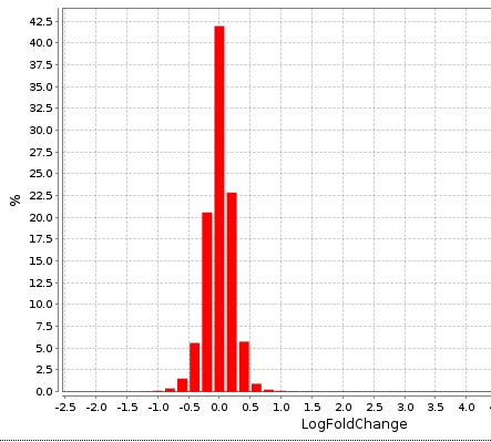
The distribution of LogFoldChange values is shown in the Histogram:
GSEA by GO categories and metabolic pathways for a single gene table
This workflow performs the GSEA divided by the three branches of Gene Ontology, biological process, molecular function and cellular component, as well as by the Reactome pathways, for any input gene or protein table. It is important to note that such a table should have a column which can be used as a weight column for enrichment, e.g. expression value.
To launch the workflow, follow these steps:
Step 1 Open the workflow input form from the Start page. It opens in the main Work Space and looks as shown below:
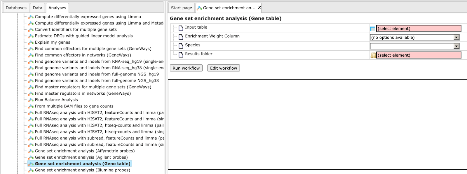
Step 2 Input a gene table with FoldChange (LogFoldChange) calculated. You can either drag-and-drop or click on the select element box to specify the table in the Tree area. Here, the table from the Example folder/HCV infection in liver GSE31193, Affymetrix U133 Plus 2.0 is used. We aim to find out the enriched functional categories of gene expression upon treatment with IFN type III after 24 hours versus non-treated cells.
The input table may look like the one shown below. This table contains the column logFC (LogFoldChange). This table is an output of the Limma method. Input table used for this example can be accessed using the URL:
For best GSEA results, input the table with all genes analyzed, e.g. all genes present on the chip in the microarray experiment.

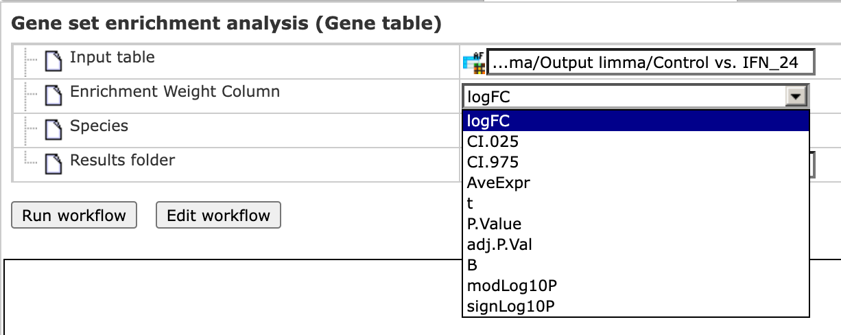
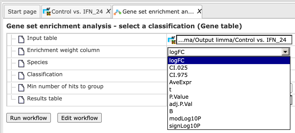
Step 3 As soon as you specify the input table, the drop-down menu in the field Enrichment Weight Column becomes active. It presents all numerical columns in the input table. Select which column should be used for enrichment calculations. Here, the column logFC is selected.
Step 4 Choose human, mouse, or rat species from the drop-down menu.
Step 5 Specify location and name of the Results folder. It is important to note that the results folder should be located in your Project in the tree.
Step 6 Press the button [Run workflow] and wait till the workflow is completed.
Results
The results folder contains four tables with the results of the enrichment analysis corresponding to the three branches of Gene Ontology, biological process, molecular function and cellular component as well as by the Reactome pathways.
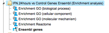
The GSEA results are described in detail in a separate section “About the GSEA analysis and the interpretation of the results”. The output folder can be accessed through the path:
GSEA by GO categories, signaling pathways and diseases
Also, this type of gene set enrichment analysis (GSEA) can be done by either starting from raw data of any of the widely used experimental platforms (Affymetrix, Agilent, or Illumina), or from a single gene table that you may have composed yourself.
Affymetrix, Agilent and Illumina microarrays
The three workflows under this category are similar to the workflows described above in the 1st part, requiring exactly the same two normalized input tables, and the same steps to launch these workflows. The difference is in the ontologies applied. The three workflows under this category are designed to perform a GSEA utilizing the three branches of the HumanPSD™-curated gene ontology, HumanPSD™ biological process, HumanPSD™ molecular function and HumanPSD™ cellular component as well as the TRANSPATH® pathways:
Gene Set Enrichment Analysis HumanPSD (Affymetrix probes),
Gene Set Enrichment Analysis HumanPSD (Agilent probes),
Gene Set Enrichment Analysis HumanPSD (Illumina probes).
The GSEA results are described in detail in a separate section “About the GSEA analysis and the interpretation of the results”.
Note. This workflow is available together with a valid HumanPSD™/TRANSPATH® license. Please feel free to ask for details (info@genexplain.com).
Single gene table
This workflow is similar to the GSEA by GO categories workflow, it requires exactly the same format of the input table, and the steps to launch this workflow are the same. The difference is in the ontologies applied. This workflow is designed to perform a GSEA utilizing the three branches of the HumanPSD™-curated gene ontology, HumanPSD™ biological process, HumanPSD™ molecular function and HumanPSD™ cellular component, as well as the TRANSPATH® pathways.
The GSEA results are described in detail in a separate section “About the GSEA analysis and the interpretation of the results”.
Note. This workflow is available together with a valid HumanPSD™/TRANSPATH® license. Please feel free to ask for details (info@genexplain.com).
GSEA with a selected ontology
This workflow performs a GSEA with one selected ontology for an input gene or protein table. It is important to note that such a table should have a numerical column which can be used as a weight column for enrichment, e.g. expression value or fold change.
To launch the workflow, follow these steps:
Step 1 Open the workflow input form from the Start page. It opens in the main Work Space and looks as shown below:
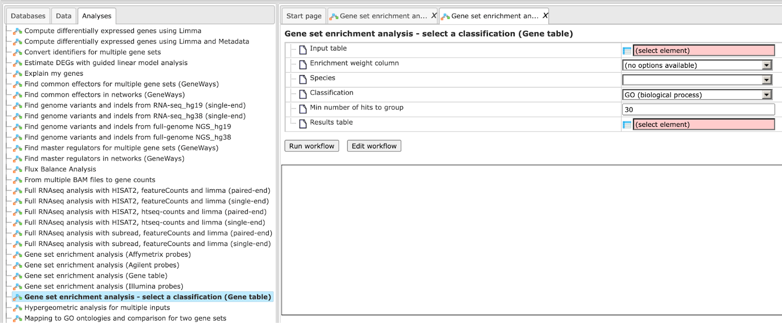
Step 2 Input a gene table with FoldChange (LogFoldChange) calculated. You can either drag-and-drop or click on the select element box to specify the table in the Tree area. Here, the table from the Example folder/ HCV infection in liver GSE31193, Affymetrix U133 Plus 2.0 is used. We aim to find out the enriched functional categories of gene expression upon treatment with IFN type III after 24 hours versus non-treated cells.
The input table may look like the one shown below. This table contains the column logFC (LogFoldChange). This table is an output of the Limma method.
For the best GSEA results, input the table with all genes analyzed, e.g. all genes present on the chip in the microarray experiment.
Step 3 As soon as you specify the input table, the drop-down menu in the field Enrichment Weight Column becomes active. It presents all numerical columns in the input table. Select which column should be used for enrichment calculations. Here, the column logFC is selected.
Step 4 Choose human, mouse, or rat species from the drop-down menu.
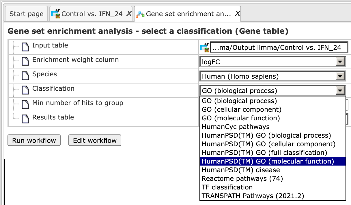
Step 5 In the field Classification, choose the ontology from the drop-down menu. Here, GO biological process is selected.
Step 6 Define a minimal number of hits in one group which you would like to consider in the field Min number of hits to group. By default it is 30.
Step 7 Specify location and name of the Results folder. Please note that the results folder should be located in your Project in the tree.
Step 8 Press the button [Run workflow] and wait till the workflow is completed.
Results
The results folder contains one table with the results of the enrichment analysis by the selected ontology. It can be accessed using the URL:
The GSEA results are described in detail in a separate section “About the GSEA analysis and the interpretation of the results”.
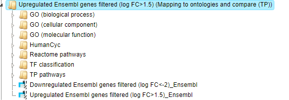
Functional classification
An alternative approach to GSEA is another group of workflows, Functional classification, which comprises several “Mapping to ontologies” workflows. The difference of this option to GSEA is that no enrichment of the categories is calculated, but that all genes in the list are mapped to GO categories or other ontologies. For example, you can use tables with pre-calculated up-regulated or down-regulated genes, as they are obtained as output of the workflow “Detect differentially expressed genes”, and use these as input into the workflows „Mapping to ontologies “.
The output tabulates which and how many genes from your list (“hits”) fall into which category, how many known genes are in this category, how many hits would have been expected by chance, and what the P-value for the found number of hits being obtained by chance is.
The difference between the workflows within this group is in the ontologies applied as well as in the number of input tables.
Mapping to GO categories and metabolic pathways
Single gene or protein table
This workflow is designed to classify an input gene set based on several ontologies, and to identify terms hits for which are overrepresented in the input set. The input file can be any gene or protein table. There is only one obligatory column, the column with gene or protein IDs; all other columns are optional. In the first step, the input table is converted into a table with Ensembl Gene IDs. This table with Ensembl Gene IDs is subjected to a functional classification.
To launch the workflow, follow these steps:
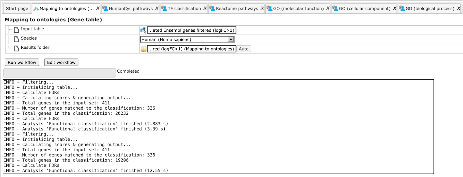
Step 1 Open the workflow input form from the Start page. It looks as shown below:
Step 2 Specify the input table. The input gene set might be a list of differentially regulated genes or any gene or protein list of interest. You can drag it from your project within the tree area and drop it in the pink box of the field Input table. Alternatively, you may click on the pink field “select element” and a new window will be opened, where you can select the input gene set as shown below.
The further steps of the workflow are demonstrated for the upregulated genes shown here:
Step 3 Specify the biological species of the input set in the field Species by selecting the required biological species from the drop-down menu.
Step 4 Define where the folder with the results should be located in the tree. You can do so by clicking on the pink field select element in the field Results folder, and a new window will be opened, where you can select the location of the results folder and define its name.
Step 5 Press the [Run workflow] button.
The workflow is running as shown below, wait till it is completed.
The results folder can be found here:
It contains several tables with the resulting mapping, one table each for the
applied ontological groups, as well as one gene table ( ) as shown below:
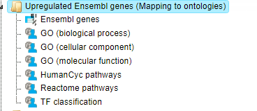
When the workflow is completed, all output tables are opened by default.
Let’s consider the output tables.
Mapping to the three GO branches, biological processes, cellular components, and
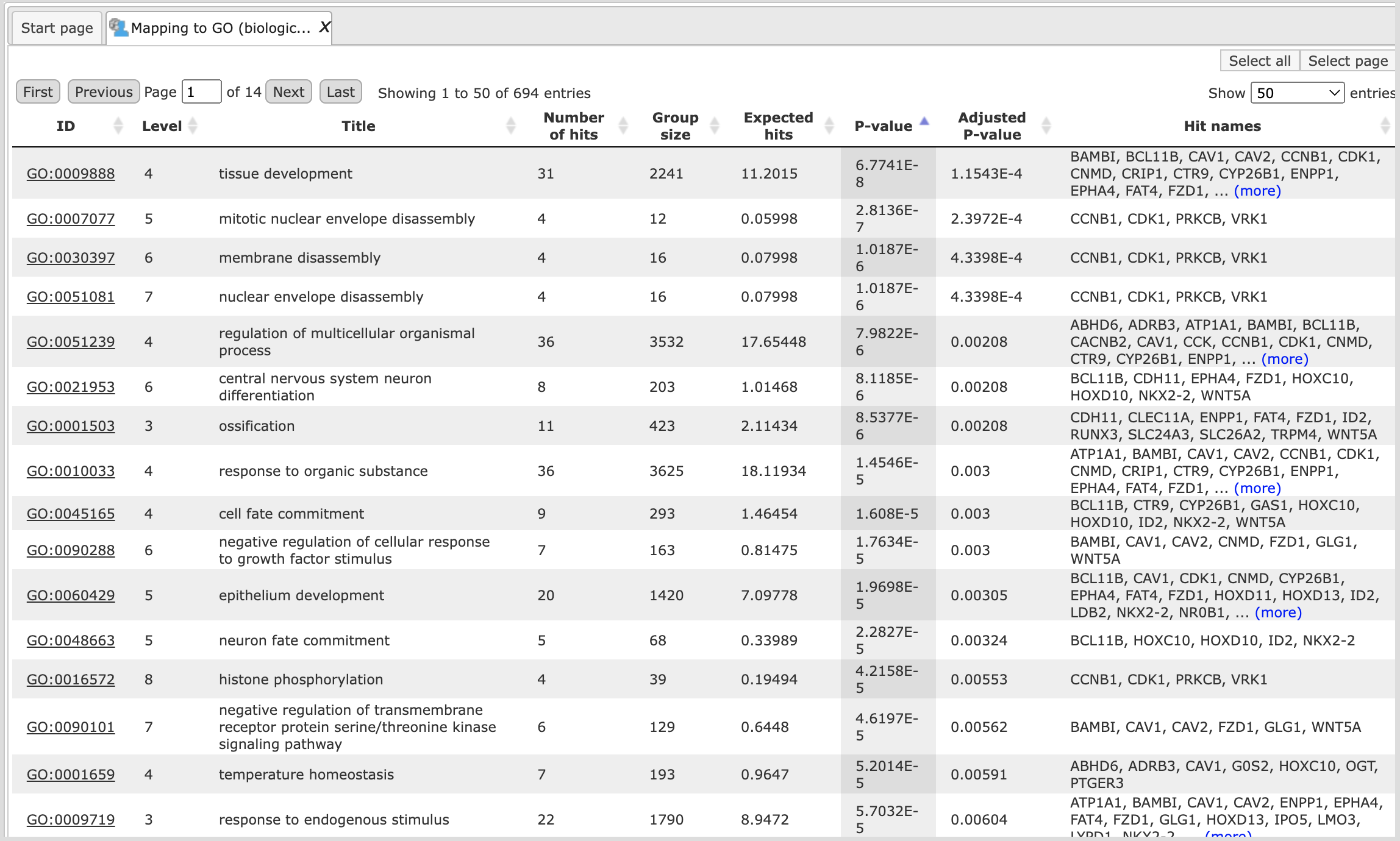
molecular functions ( ). The tables with the enriched categories look like:
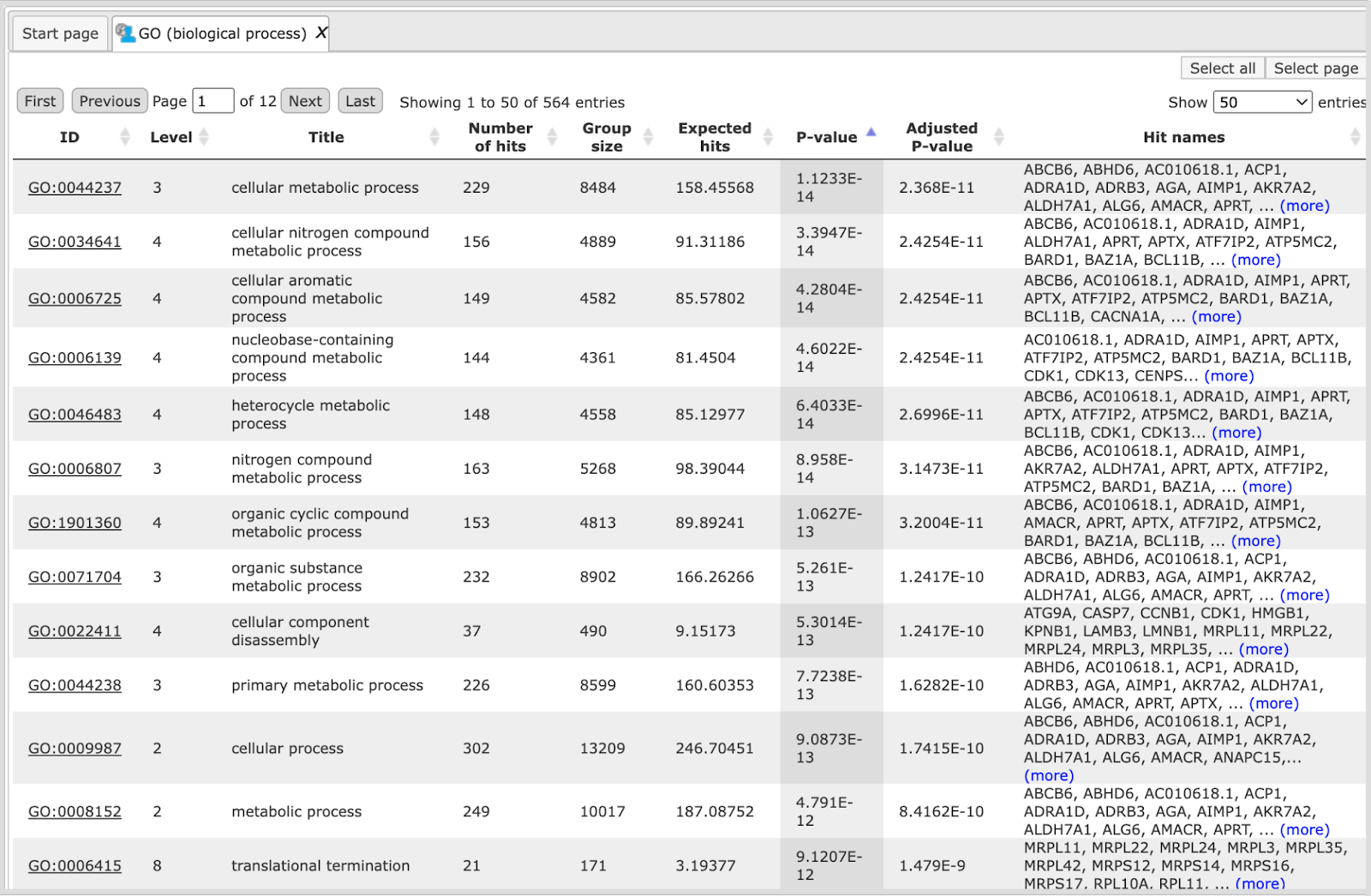
Each row presents details about one ontological term. The column ID comprises the identifier of the ontological category, here identifiers of Gene Ontology biological process terms. These identifiers are hyperlinked to the page http://www.ebi.ac.uk/QuickGO/ where you can get further information about this ontological term.
The columns Title and Group size contain further details about the ontological terms, its title and the number of genes linked to this term in the corresponding database, here in GO. The column Expected hits shows the number of genes expected to fall into this category by random chance, based on the size of the input set and the size of the category. The column Number of hits shows how many genes from the input table fall into this category. P-value and Adjusted p-value are calculated for the difference between expected and real numbers of hits. The genes mapped to each category are explicitly listed in the column Hit names. As the lists can get quite long, only a few genes are shown by default in each row. To get the full list, press [more].
Tip The hits for one or several selected rows can be saved as a separate gene table. This can be done with the button Save hits in the top control menu. Such genes tables can be analyzed further, e.g. to find master regulatory molecules in the networks, and to identify transcription factors that might commonly regulate these genes.
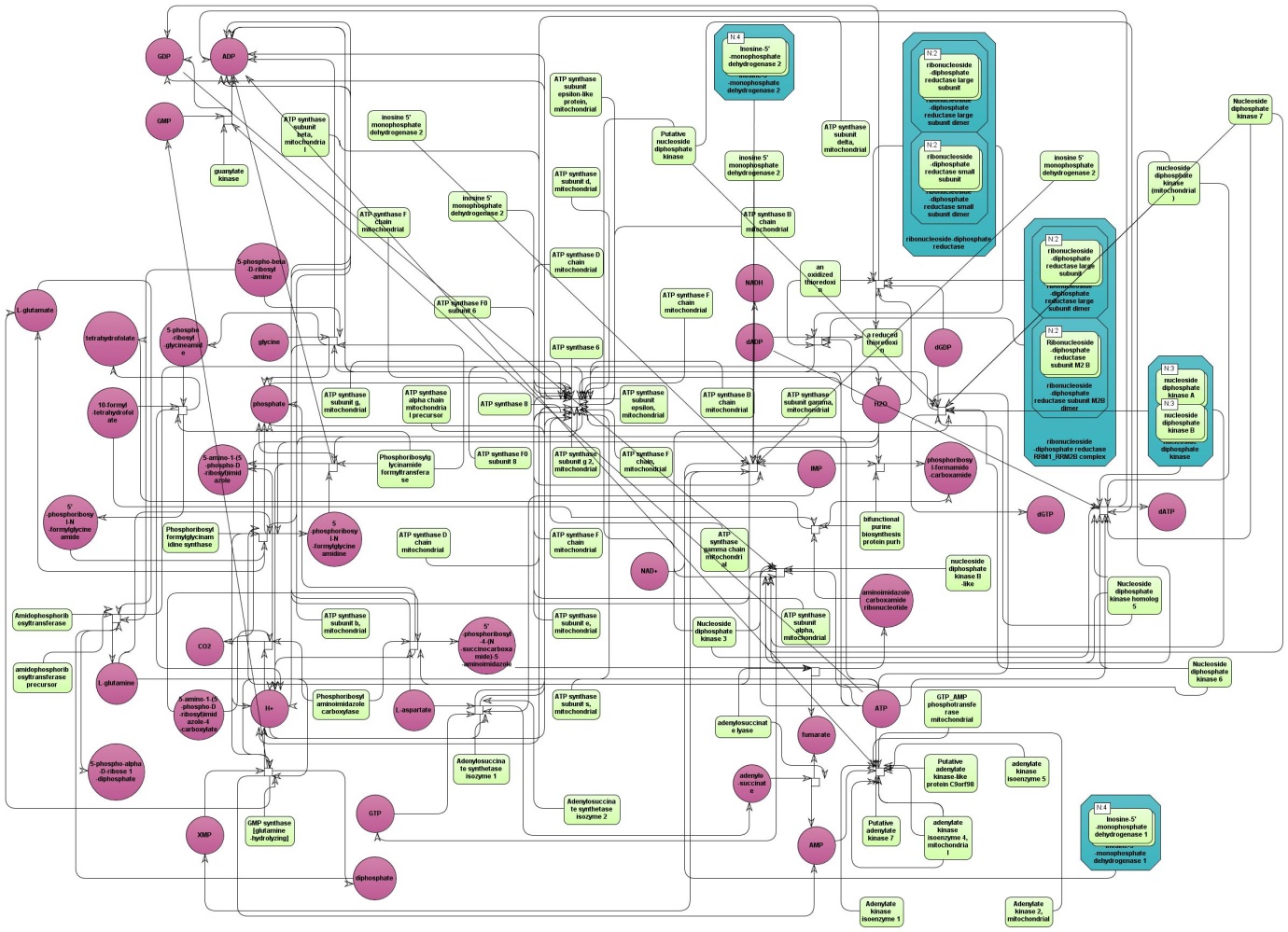
The table HumanCyc pathways (). In the column ID the identifiers of the HumanCyc pathways are given. Upon a mouse click, a diagram of the corresponding metabolic pathway opens in the
workspace:
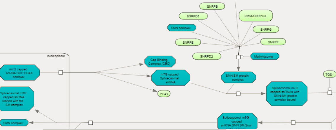
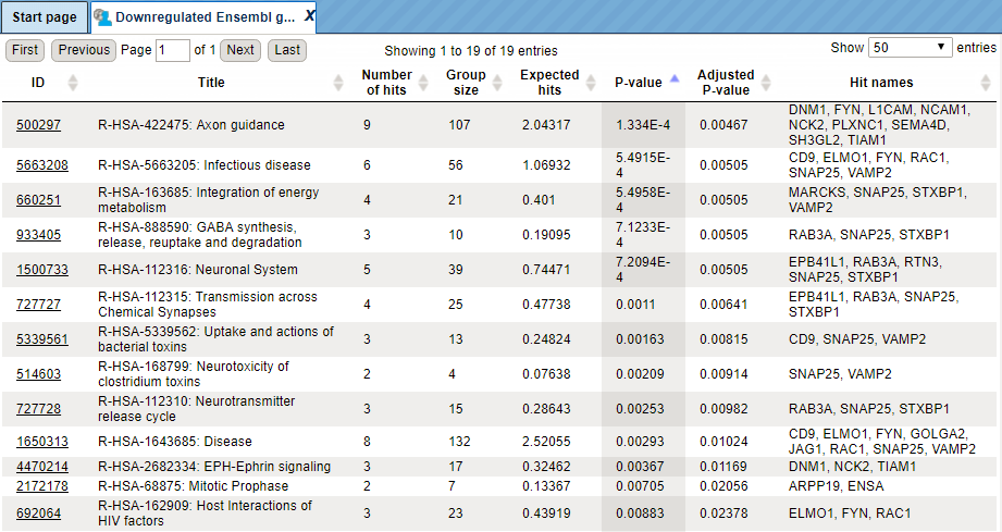
The table Reactome pathways (). In the column ID you can find the identifiers of the Reactome pathways.
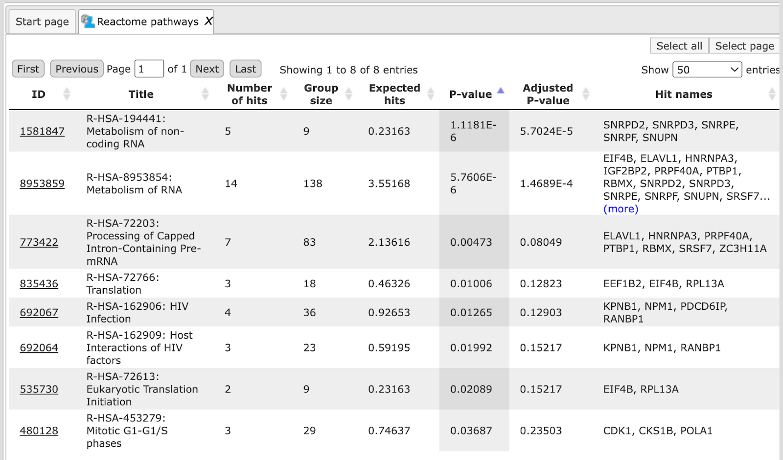
Upon a mouse click, a diagram of the corresponding pathway opens in the workspace.
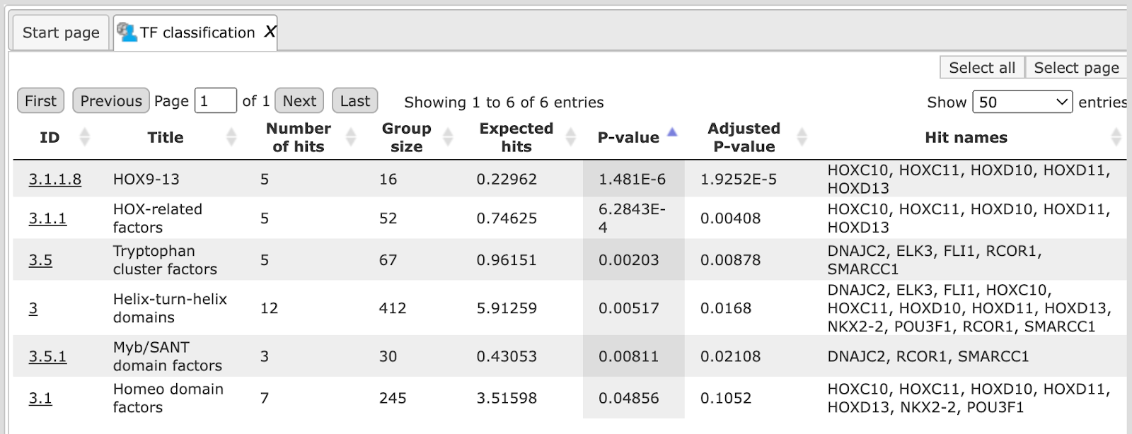
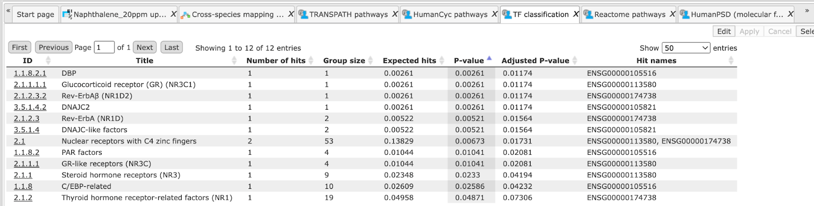
The table TF classification (). Your input table is mapped to the classification of Transcription factors (Nucleic Acids Res. 41, D165-D170 (2013)), which is also integrated in the
platform. In the column ID the identifiers of the TF classification are shown.
They are hyperlinked to the corresponding classification categories.
The table Ensembl genes ( ). The input gene or protein table is converted to a table with Ensembl gene IDs, and the result is shown in this table. For example, if your input was a
table with UniProt IDs, it is converted into Ensembl gene IDs and included in
the results folder of this workflow.
). The input gene or protein table is converted to a table with Ensembl gene IDs, and the result is shown in this table. For example, if your input was a
table with UniProt IDs, it is converted into Ensembl gene IDs and included in
the results folder of this workflow.
Gene sets and comparison
This workflow is designed to map two input tables to all Gene Ontology categories (biological process, molecular function and cellular component) to identify terms hits and to compare the results. While the workflow described above allows for selecting one particular ontology, this workflow runs three branches of the GO ontology in parallel, and the comparison between two gene sets is done regarding all three GO branches at once. The input files can be any gene or protein table. In the first step, the input tables are converted into two tables with Ensembl Gene IDs. These new tables are subjected to a Gene Ontology mapping. As result two mapped tables (for each GO category) are stored and further compared via P-values. This last comparison step is based on the method analyses/Methods/Statistical analysis/Compare analysis results. The comparison can help to reveal items that show different enrichment across certain conditions.
To launch the workflow, follow these steps:
Step 1 Open the workflow input form from the Start page. It looks as shown below:
Step 2 Specify the input tables 1 and 2. The input gene sets might be lists of differentially regulated genes or any gene or protein list of interest. You can drag it from your project within the tree area and drop it in the pink box of the field Input table. Alternatively, you may click on the pink field “select element” and a new window will be opened, where you can select the input gene set as shown below.
The further steps of the workflow are demonstrated for the genes shown to be up-regulated (Top100) and down-regulated (Top100) in one of the pre-prepared examples, can be found here:
Step 3 Specify the biological species of the input set in the field Species by selecting it from the drop-down menu.
Step 4 Define where the folder with the results should be located in the tree. You can do so by clicking on the pink field select element in the field Result folder, and a new window will be opened, where you can select the location of the result folder and define its name.
Step 5 Press the [Run workflow] button.
When the workflow is completed, the result folder is opened by default, it is found here:
The result folder contains the three subfolders GO for all three GO categories
applied in this workflow and two tables (). The two tables correspond to the input tables with the identifiers converted into Ensembl gene IDs. Each subfolder contains two tables with the mapped ontology results,
one table with the analysis comparison result and one plot.
Multiple gene sets
This workflow is designed to classify several sets of genes or proteins based on the three GO branches, Reactome and HumanCyc pathways and TF classification. Several input gene or protein tables should be located in one folder.
The input is a folder with several gene or protein tables. The steps of this workflow for each individual gene or protein table are the same as described in the section above. The same steps are performed iteratively for each of the gene or protein tables in the input folder.
The output is a folder which contains subfolders with the results for each individual input table. The subfolders are automatically given the same names as the input tables.
Mapping to GO categories and signaling pathways
Single gene or protein table
The steps of this workflow are the same as described above, only difference is in the ontologies applied. In this workflow, your input table is mapped to GO biological processes, GO cellular components, GO molecular functions, Reactome, HumanCyc, TF classification and TRANSPATH® pathways.
The genes in the input table are mapped to the TRANSPATH® pathways using the latest TRANSPATH® release available in the platform. The columns ID, Title and Group size present information about the TRANSPATH® pathways significantly enriched among your input genes. Results Folder is found here:
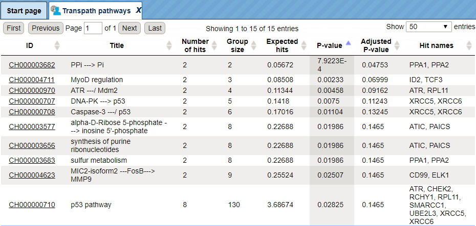
The pathway identifiers provide a link to open the corresponding pathway as a diagram in the work space. In the screenshot below a fragment of the IFN alpha/beta pathway is opened.
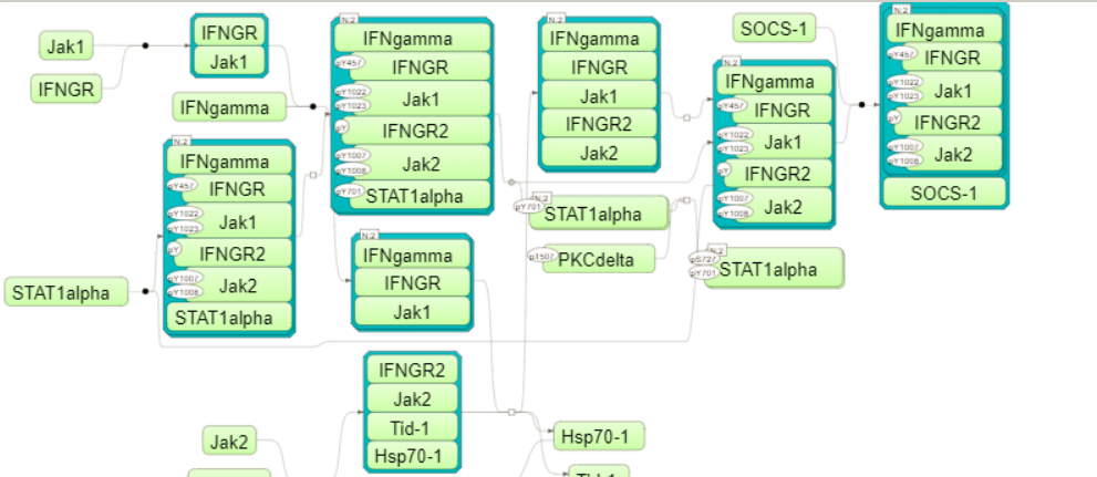
Tip You can work with the pathway diagrams as with other diagrams in the platform. For example, you can map expression data, save a copy, and export in a number of different formats. To save all genes linked to this diagram as a separate gene table, you need to select the corresponding row in the table with the classification results and apply the Save hits button from the top control menu.
Note This workflow is available together with a valid TRANSPATH® license.
Please feel free to ask for details (info@genexplain.com).
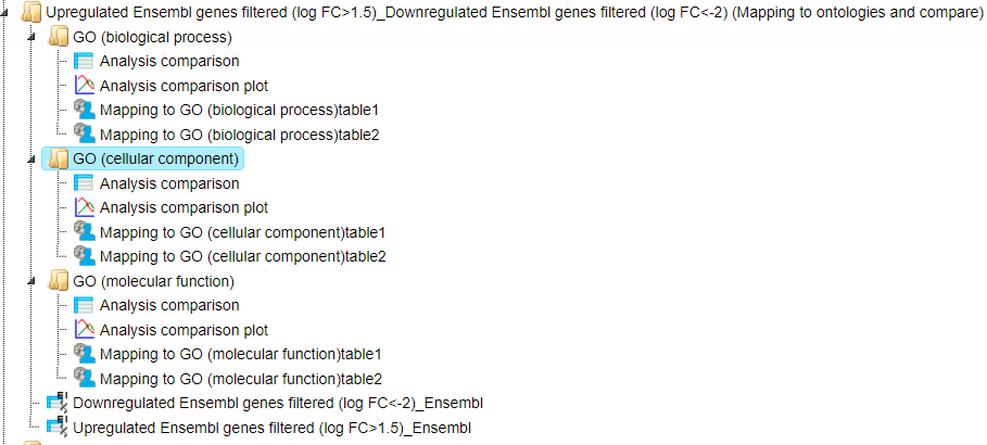
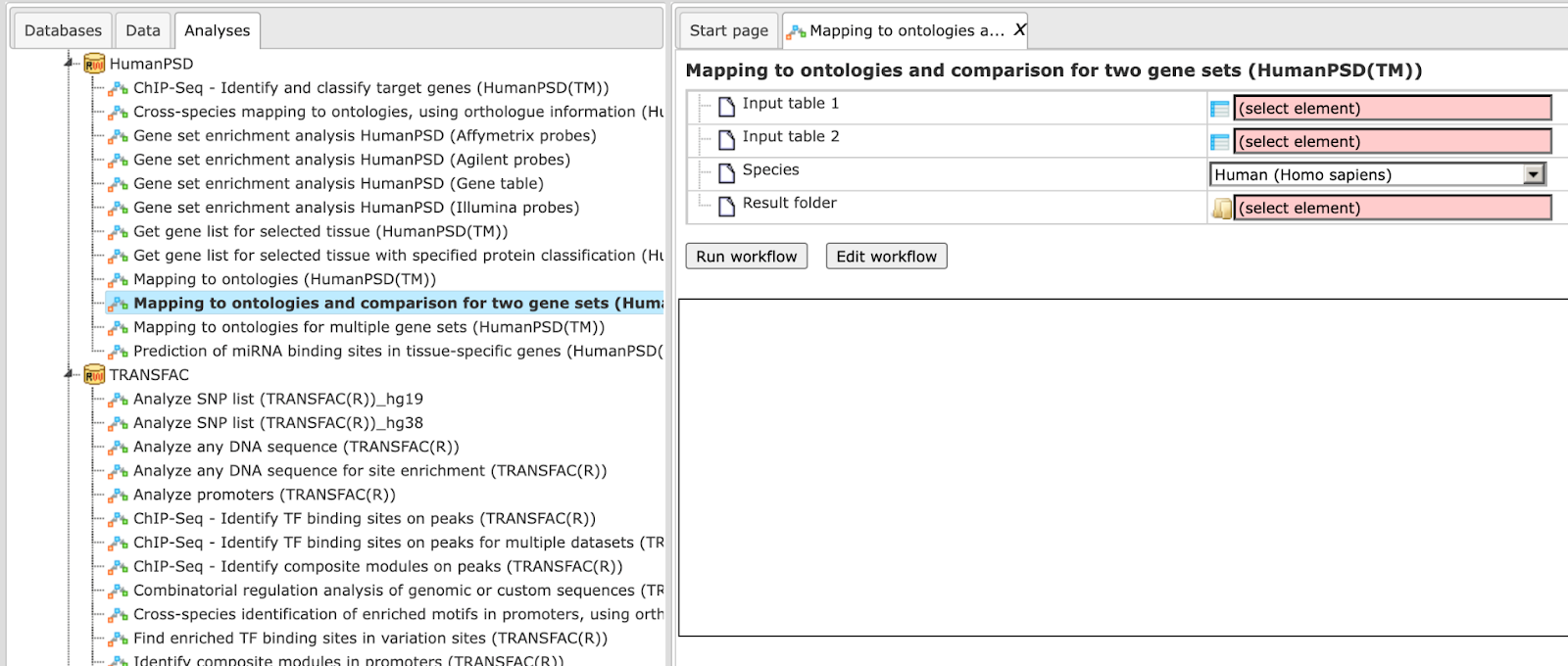
Mapping to ontologies and comparison for two gene sets (TRANSPATH®)
The specialty of this workflow in comparison with the one described above is in
the ontologies applied. This workflow is designed to map two input tables to the
seven following ontologies, the public Gene Ontology categories (biological
process, molecular function and cellular component), TRANSPATH®, Reactome
and HumanCyc pathways as well as transcription factor classification to identify
hits and to compare the results. Similar to the workflows described above, the
input can be any gene or protein tables. In the first step, the input tables are
converted into two tables with Ensembl Gene IDs. These tables are subjected to a
functional mapping. The last comparison step is based on the method
analyses/Methods/Statistical analysis/Compare analysis results, ( )
)
The comparison can help to reveal items that show different enrichment across certain conditions.
To launch the workflow, follow these steps:
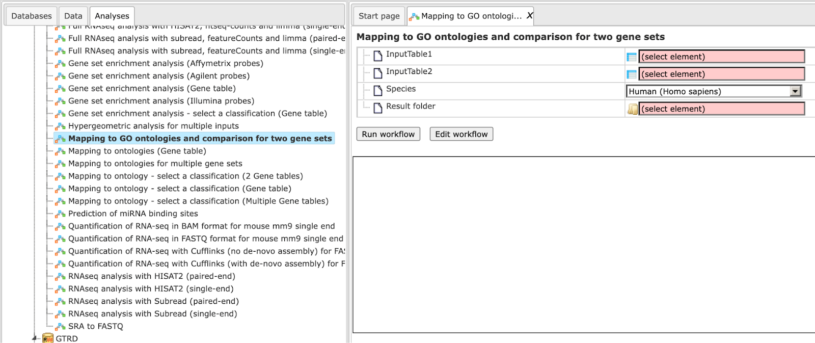
Step 1 Open the workflow input form from the Start page. It looks as shown below:

Step 2 Specify the input tables 1 and 2. The input gene sets might be lists of differentially regulated genes or any gene or protein list of interest. You can drag it from your project within the tree area and drop it in the pink box of the field Input table. Alternatively, you may click on the pink field “select element” and a new window will be opened, where you can select the input gene set as shown below.
The further steps of the workflow are demonstrated for the genes shown to be up-regulated (Top100) and down-regulated (Top100) in one of the pre-prepared examples.<!– The pertinent example file can be found in the geneXplain platform under:
Step 3 Specify the biological species of the input set in the field Species by selecting it from the drop-down menu.
Step 4 Define where the folder with the results should be located in the tree. You can do so by clicking on the pink field select element in the field Result folder, and a new window will be opened, where you can select the location of the result folder and define its name.
Step 5 Press the [Run workflow] button.
When the workflow is completed, the result folder is opened by default.
The result folder contains the seven subfolders; one subfolder for each applied
ontology and two tables (). The two tables correspond to the input tables with the identifiers converted into Ensembl gene IDs.
Each subfolder contains two tables with the mapped ontology/pathway/classification results, one table with the analysis comparison result and one plot. Individual tables are described in the previous sections.
Note. This workflow is available together with a valid TRANSPATH® license.Please, feel free to ask for details (info@genexplain.com).
Multiple gene sets
This workflow is designed to classify several sets of genes or proteins based on the three GO branches, Reactome and HumanCyc pathways, TF classification, and TRANSPATH® pathways. Several input gene or protein tables should be located in one folder.
The input is a folder with several gene or protein tables. The steps of this workflow for each individual gene or protein table are the same as described above. The same steps are performed iteratively for each of the gene or protein tables in the input folder.
The output is a folder which contains subfolders with the results for each individual input table. The subfolders are automatically given the same names as the input tables.
Note This workflow is available together with a valid TRANSPATH® license.
Please, feel free to ask for details (info@genexplain.com).
Mapping to GO categories, signaling pathways and diseases
Single gene or protein table
The steps of this workflow are the same as described for other mapping to ontologies workflow. The difference is in the ontologies applied. In this workflow, your input table is mapped to HumanPSD™ biological processes, HumanPSD™ cellular components, HumanPSD™ molecular functions, HumanPSD™ disease, Reactome, HumanCyc, TF classification and TRANSPATH® pathways.
The results folder contains several tables with the resulting mapping, one table
each for each applied ontological group , as well as one gene table () as shown below.
When the workflow is completed, all the output files are opened by default. The output file HumanPSD (disease) when opened in the work space looks is shown here:
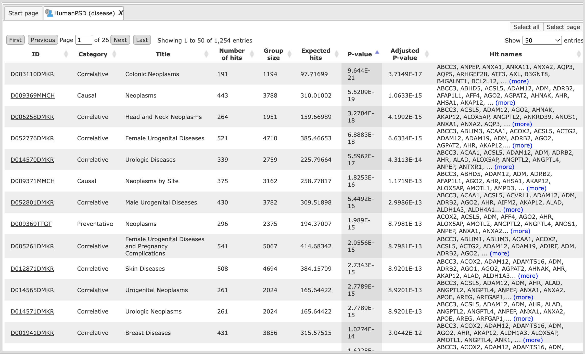
The columns ID, Category, Title and Group size present information about the diseases, as they are curated in the HumanPSD™ database, significantly enriched among your input genes.
Each disease identifier is hyperlinked to an external web page, the Comparative Toxicogenomic Database, where you can find more details about this disease:
Note This workflow is available together with a valid HumanPSD™/TRANSPATH® license. Please, feel free to ask for details (info@genexplain.com).
Mapping to GO ontologies and comparison for two gene sets (HumanPSD™):
The overall idea of this workflow is similar to that described above. However, this workflow is designed to map two input tables, to identify hits and to compare the results according to the eight particular ontologies. These are five proprietary ontologies (BIOBASE GmbH), namely the HumanPSD™-curated Gene Ontology categories (HumanPSD™ biological process, HumanPSD™ molecular function and HumanPSD™ cellular component), HumanPSD™ disease and TRANSPATH® pathways, as well as three public ontologies, Reactome pathways, HumanCyc metabolic pathways and the transcription factor classification.
Similarly to the workflows described above, the input can be any gene or protein
tables. In the first step, the input tables are converted into two tables with
Ensembl Gene IDs. These tables are then subjected to a functional mapping to the
eight listed ontologies in parallel. The last comparison step is based on the
method analyses/Methods/Statistical analysis/Compare analysis results,
The comparison helps to reveal ontological categories that are different between two input data sets. To launch the workflow, follow these steps:
Step 1 Open the workflow input form from the Start page. It looks as shown below:
Step 2 Specify the input tables 1 and 2. The input gene sets might be lists of differentially regulated genes or any gene or protein list of interest. You can drag it from your project within the tree area and drop it in the pink box of the field Input table. Alternatively, you may click on the pink field “select element” and a new window will be opened, where you can select the input gene set.<!– as shown below.
The further steps of the workflow are demonstrated for the genes found here:
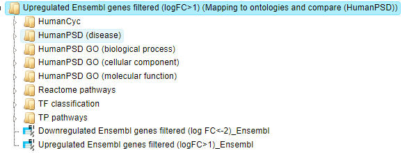
<https://platform.genexplain.com/bioumlweb/#de=data/Examples/Brain%20Tumor%20GSE1825%2C%20Affymetrix%20HG-U133A%20microarray/Data/Ewing%20Family%20Tumor%20versus%20Neuroblastoma/ Upregulated%20Ensembl%20genes%20filtered%20(logFC%3E1)>
<https://platform.genexplain.com/bioumlweb/#de=data/Examples/Brain%20Tumor%20GSE1825%2C%20Affymetrix%20HG-U133A%20microarray/Data/Ewing%20Family%20Tumor%20versus%20Neuroblastoma/ Downregulated%20Ensembl%20genes%20filtered%20(log%20FC%3C-2)>–>
Step 3 Specify the biological species of the input set in the field Species by selecting it from the drop-down menu.
Step 4 Define where the folder with the results should be located in the tree. You can do so by clicking on the pink field select element in the field Result folder, and a new window will be opened, where you can select the location of the result folder and define its name.
Step 5 Press the [Run workflow] button.
When the workflow is completed, the result folder is opened by default.
The result folder contains eight subfolders; one subfolder for each applied
ontology and two tables ().
The two tables correspond to the input tables with the identifiers converted into Ensembl gene IDs. Each subfolder contains two tables with the mapped ontology/pathway/classification results, one table with the analysis comparison result and one plot.
Note This workflow is available together with a valid HumanPSD™ license. Please, feel free to ask for details (info@genexplain.com).
Mapping with selected classification
Single gene set
This workflow is designed to map one input table to one selected ontology classification. The input can be any gene or protein table. In the first step, the input table is converted into one table with Ensembl Gene IDs. The table with Ensembl Gene ID is subjected to a functional classification. As a result the mapped table is stored.
To launch the workflow, follow these steps:
Step 1 Open the workflow input form from the Start page. It looks as shown below:
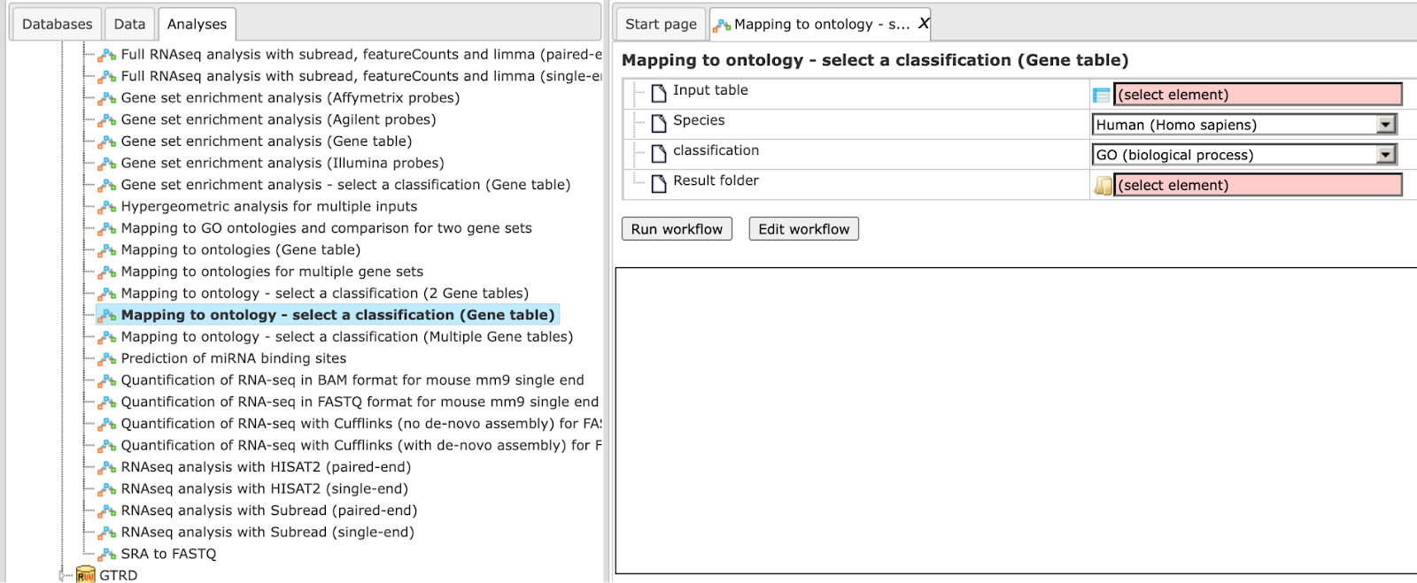
Step 2 Specify the input table. The input gene set might be the list of differentially regulated genes or any gene or protein list of interest. You can drag it from your project within the tree area and drop it in the pink box of the field Input table. Alternatively, you may click on the pink field “select element” and a new window will be opened, where you can select the input gene set.<!– found here:
Step 3 Specify the biological species of the input set in the field Species by selecting it from the drop-down menu.
Step 4 In the field Classification, choose the ontology from the drop-down menu. Here, GO biological process is selected.
Step 5 Define where the folder with the results should be located in the tree. You can do so by clicking on the pink field select element in the field Result folder, and a new window will be opened, where you can select the location of the result folder and define its name.
Step 6 Press the [Run workflow] button.
When the workflow is completed, the result folder is opened by default.
The result folder contains 1 table () with the converted Ensembl table and one table with the mapped ontology results.
Let’s consider the output table with the mapping results. The tables with the
mapped selected category () look like:
Each row presents details about one ontological term. The column ID comprises the identifiers of the ontological categories, here identifiers of Gene Ontology biological process terms. These identifiers are hyperlinked to the page http://www.ebi.ac.uk/QuickGO/ where you can get further information about this ontological term.
The columns Title and Group size contain further details about the ontological terms, its title and the number of genes linked to this term in the corresponding database, here in GO. The column Expected hits shows the number of genes expected to fall into this category by random chance, based on the size of the input set and the size of the category. The column Number of hits shows how many genes from the input table fall into this category. **P-**value and Adjusted P-value are calculated for the difference between expected and real numbers of hits. The genes mapped to each category are explicitly listed in the column Hit names. As the lists can get quite long, only a few genes are shown by default in each row. To get the full list, press [more].
Mapping to ontology - select a classification (2 Gene tables)
This workflow is designed to map each of the two input tables to one selected
ontology classification, to identify term hits and to compare the results. The
input can be any gene or protein table. In the first step, the input tables are
converted into two tables with Ensembl Gene IDs. These tables with Ensembl Gene
IDs are subjected to a functional classification. As result two mapped tables
are stored and further compared via P-values. This final comparison step is
based on the method analyses/Methods/Statistical analysis/Compare analysis
results, icon
The comparison can help to reveal terms that show different enrichment across certain conditions.
To launch the workflow, follow these steps:
Step 1 Open the workflow input form from the Start page. It looks as shown below:
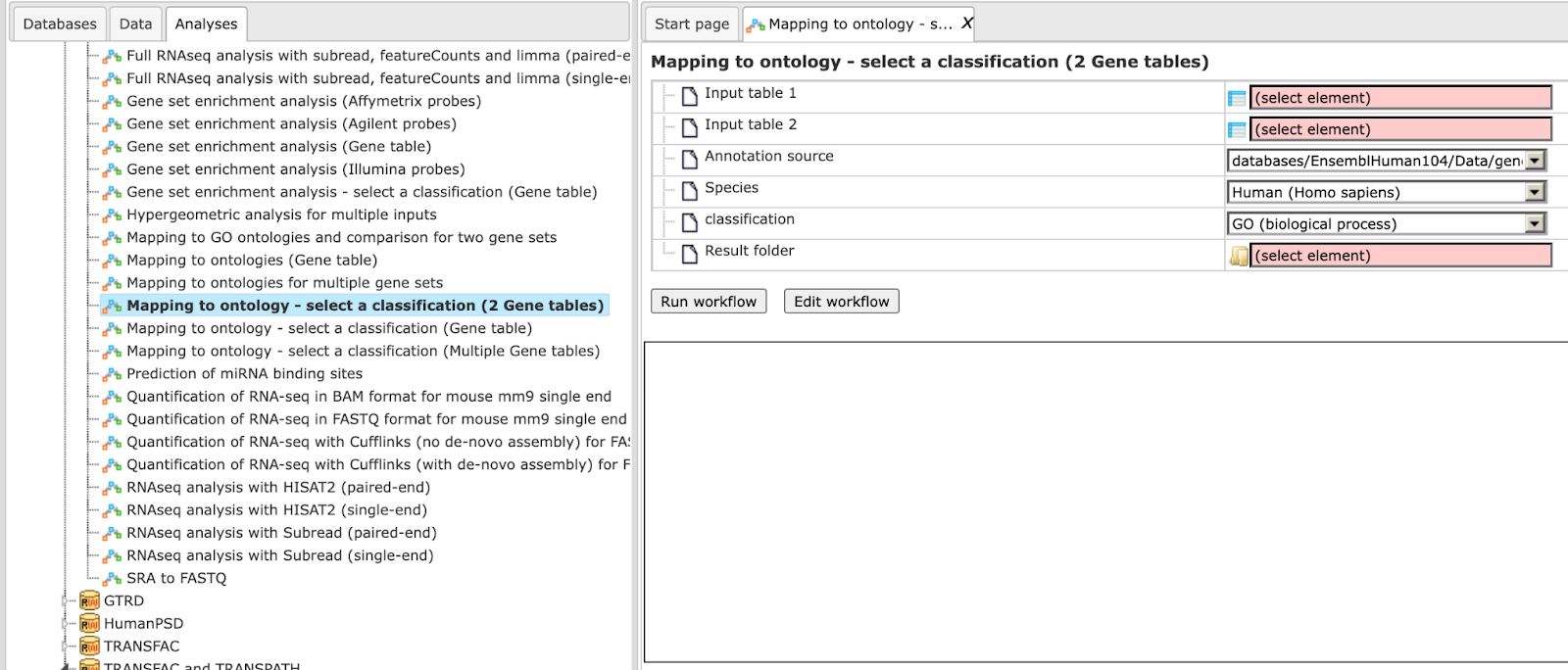
Step 2 Specify the input tables 1 and 2. The input gene sets might be the lists of differentially regulated genes or any gene or protein list of interest. You can drag it from your project within the tree area and drop it in the pink box of the field Input table. Alternatively, you may click on the pink field “select element” and a new window will be opened, where you can select the input gene set as shown below.
Step 3 Specify the biological species of the input set in the field Species by selecting it from the drop-down menu.
Step 4 In the field Classification, choose the ontology from the drop-down menu. Here, GO biological process is selected.
Step 5 Define where the folder with the results should be located in the tree. You can do so by clicking on the pink field select element in the field Result folder, and a new window will be opened, where you can select the location of the result folder and define its name.
Step 6 Press the [Run workflow] button.
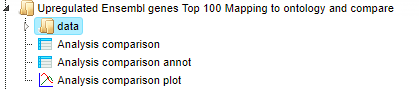
When the workflow is completed, the result folder is opened by default, found here:
The result folder contains 2 tables () with the converted Ensembl tables, two tables
with the mapped ontology results, two tables with the analysis comparison result annotated and one plot .
Let’s consider the output tables. The tables with the mapped selected category () look like:
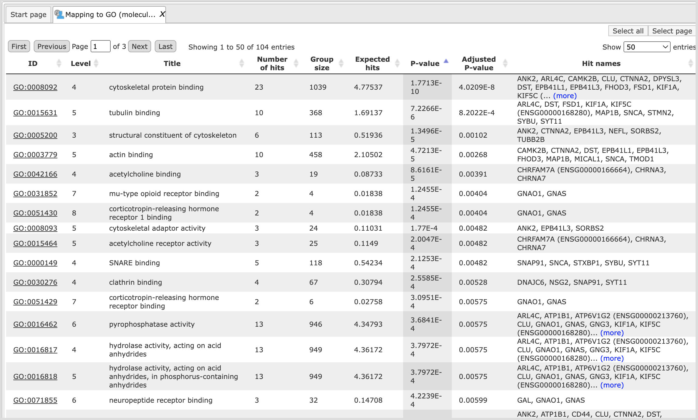
Each row presents details about one ontological term. The column ID comprises the identifiers of the ontological categories, here identifiers of Gene Ontology biological process terms. These identifiers are hyperlinked to the page http://www.ebi.ac.uk/QuickGO/ where you can get further information about this ontological term.
The columns Title and Group size contain further details about the ontological terms, its title and the number of genes linked to this term in the corresponding database, here in GO. The column Expected hits shows the number of genes expected to fall into this category by random chance, based on the size of the input set and the size of the category. The column Number of hits shows how many genes from the input table fall into this category. **P-**value and Adjusted P-value are calculated for the difference between expected and real numbers of hits. The genes mapped to each category are explicitly listed in the column Hit names. As the lists can get quite long, only a few genes are shown by default in each row. To get the full list, press [more].
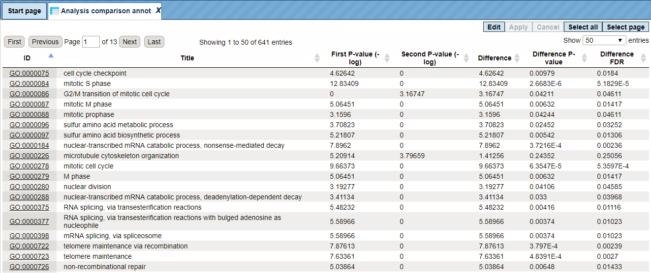
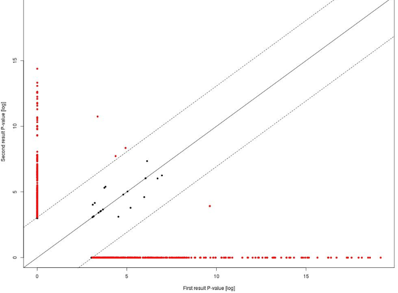
The Analysis comparison annot table lists identifiers, annotation of identifiers, P-values for the first input set of genes and P-values for the second input set of genes (-log). The column Difference shows the absolute difference between two P-values. The columns Difference P-value and Difference FDR show the statistical significance of the absolute difference and upon sorting by one of these two columns on top you can see those ontology terms that are statistically most significantly different between two input gene sets. The comparison reveals GO terms that show different enrichment across the two input gene lists.
The Analysis comparison plot is a scatter plot of P-values on the log-scale together with the diagonal and the difference cutoffs at FDR < 0.05. Every dot corresponds to one particular GO term. On the X-axis, the –log(p-value) for this GO term in the first input table is shown, and on the Y-axis, the –log(p-value) for the same GO term in the second input table is shown. The red dots correspond to those GO terms that are statistically significantly different between two input tables, with FDR<0.05. The black dots located close to the diagonal, between two dotted lines, are not significantly different between two input datasets.
Multiple gene sets
This workflow is designed to classify a multiple set of genes by enrichment
analysis using GO, Reactome, HumanCyc and TF classification databases. Gene sets
should be located in one folder.
The input table is converted into one table with Ensembl Gene IDs.
The table with Ensembl Gene ID is subjected to functional classification based on the classification option selected in the input field.
The output consists of a folder which stores the mapped classification table. Each output table consists of many columns. The column ID comprises the identifiers of the ontological categories, here identifiers of Gene Ontology biological process terms. These identifiers are hyperlinked to the page http://www.ebi.ac.uk/QuickGO/ where you can get further information about this ontological term.
The columns Title and Group size contain further details about the ontological terms, its title and the number of genes linked to this term in the corresponding database, here in GO. The column Expected hits shows the number of genes expected to fall into this category by random chance, based on the size of the input set and the size of the category. The column Number of hits shows how many genes from the input table fall into this category. P-value and Adjusted P-value are calculated for the difference between expected and real numbers of hits. The genes mapped to each category are explicitly listed in the column Hit names.
The same steps are repeated for the next input table, and several cycles are performed automatically corresponding to the number of tables in the input folder.
Cross-species mapping to ontologies, using ortholog information (HumanPSD™)
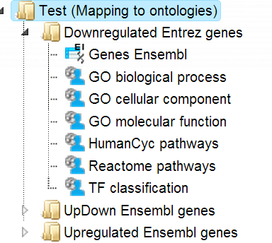
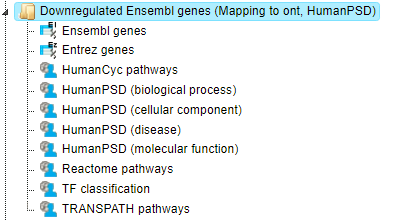
The Input can be any gene or protein table for mouse or rat. The workflow will convert the list to desired species output and map it to various ontologies. In this workflow, your input table is mapped to HumanPSD™ biological processes, HumanPSD™ cellular components, HumanPSD™ molecular functions, HumanPSD™ disease, Reactome, HumanCyc, TF classification and TRANSPATH® pathways. It can be found under the tab Workflows, in the folder HumanPSD™/Cross-species mapping to ontologies, using ortholog information (HumanPSD™). The input form of the workflow looks as shown below:
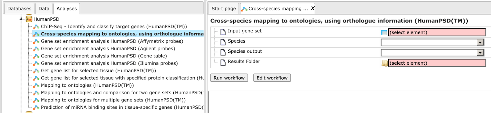
Step 1: Input the gene or protein table of any species for which you wish to map gene ontologies. You can drag & drop it from your project within the tree area. Alternatively, you may click on the pink field “select element” and a new window will open, where you can select the input table.
Here further steps are demonstrated with a Mouse gene table found here:
Select the species of the input table
Step 2: Select the desired species of the output table.
Specify the path to store the results and the name of the output folder.
Having filled in the input form, launch the workflow with the [Run] button. Wait till the workflow is completed.
Here the input mouse data is functionally classified and mapped to human data.
In the first step of the workflow, the input gene table is converted to the desired Ensemble gene table using the method ‚convert table via homology ‘. In the next step the converted Ensembl gene table is functionally classified using the HumanPSD database with a p_value threshold of 0.05. The output results folder contains diverse files as shown below:
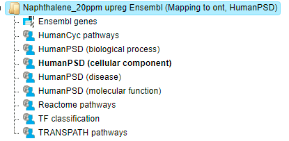
Mapping to the three GO branches, biological processes, cellular components, and
molecular functions ( ). The tables with the enriched categories look like:
For each ontological term several parameters are calculated, including expected number of hits, actual number of hits, p-value, as well as hit names and the link to the corresponding ontological term. The columns Title and Group size contain further details about the ontological terms, its title and the number of genes linked to this term in the corresponding database, here in GO. The column Expected hits shows the number of genes expected to fall into this category by random chance, based on the size of the input set and the size of the category. The column Number of hits shows how many genes from the input table fall into this category. P-value and Adjusted p-value are calculated for the difference between expected and real numbers of hits. The genes mapped to each category are explicitly listed in the column Hit names. As the lists can get quite long, only a few genes are shown by default in each row. To get the full list, press [more].
The Tables Reactome pathways, Transpath pathways, and humanCyc pathways give the results of the mapping of the input gene set to each of these pathways. Each table has a unique identifier for the corresponding pathway; upon a mouse click, a diagram opens in the workspace.

The table TF classification(). Your input table is mapped to the classification of Transcription factors
(Nucleic Acids Res. 41, D165-D170 (2013)), which is also integrated in the platform. In the column ID the identifiers of the TF classification are shown. They are hyperlinked to the corresponding classification categories:
Analyze regulatory regions
This set of workflows helps to find putative TF binding sites in the DNA sequences under study. There are several workflows in this group that perform searches in different genomic regions, either in promoters, in the peaks calculated from ChIP-seq data, or in any input DNA sequences. This group of workflows is designed using the core functionality of a “site search on gene set” analysis as described in the methods description.
Motif quality analysis
This tool analyzes the quality of a motif model. The “Motif quality analysis” item is located in the NGS folder of the analysis methods ([analyses/Methods/Site analysis/Motif quality analysis] (http://genexplain-platform.com/bioumlweb/#de=analyses/Methods/NGS/Mutation%20effect%20on%20sites)) and in the start page group ‘Microarrays’ under section ‘Analyze regulatory regions’.
Step 1 Open the analysis form from the Start page. It will open in the main Work Space and looks as shown below:
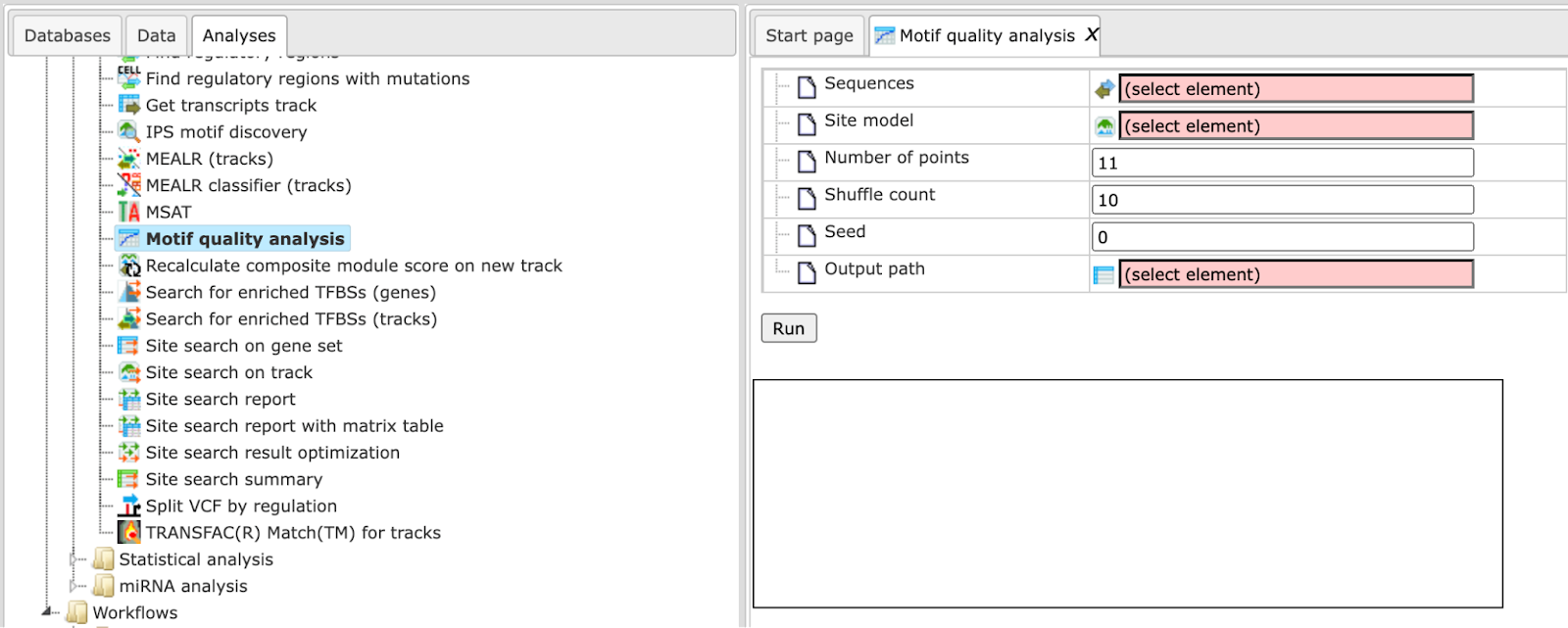
Step 2 The Sequences input is a track file with sequences containing the motif.
The following link directs to an example input:
Step 3 Select a Site model from a profile which can be used to compare the input motif. The model can result from a workflow generated ‘Profile’, can be selected from the TRANSFAC® database or can be built from the ‘Create profile from matrix library’ method (input is ChIPHorde or DiChIPHorde motif).
For this example we selected the profile:
CEBP H1-hESC cells motif profile
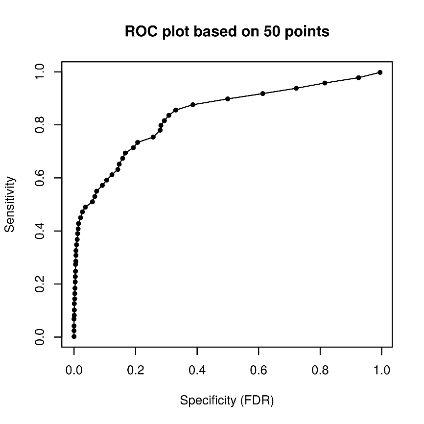
Step 4 Specify the total Number of points for sensitivity and FDR calculation. By default, the analysis uses 11 points. For example we use 50 points.
Step 5 Specify the number of Shuffle counts. This is the number of times sequence characters are shuffled to generate random sequences for FDR estimation. By default this number is 10.
Step 6 Select a Seed for the random number generator or keep the default of 0.
Step 7 Declare the Output path to store results in the tree area.
After entering the input parameters, press ‘RUN’. The method starts as shown below:
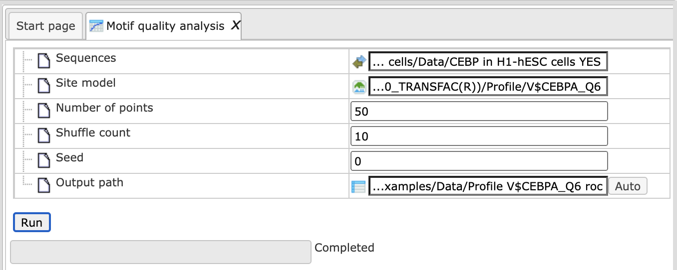
Post completion the output table is opened in the work space in a new tab and consists of a table like the one shown below. <!–Path to the examples is here:
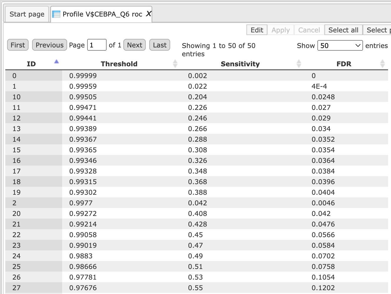
The output table can be used to create a ROC curve for the visualization of the motif quality and for comparison of different motifs.
Create matrix logo
This tool creates logo representations for position weight or frequency matrices of transcription factor binding sites.
The input can be a profile with a set of matrices or a single matrix.
The input form is as shown below:
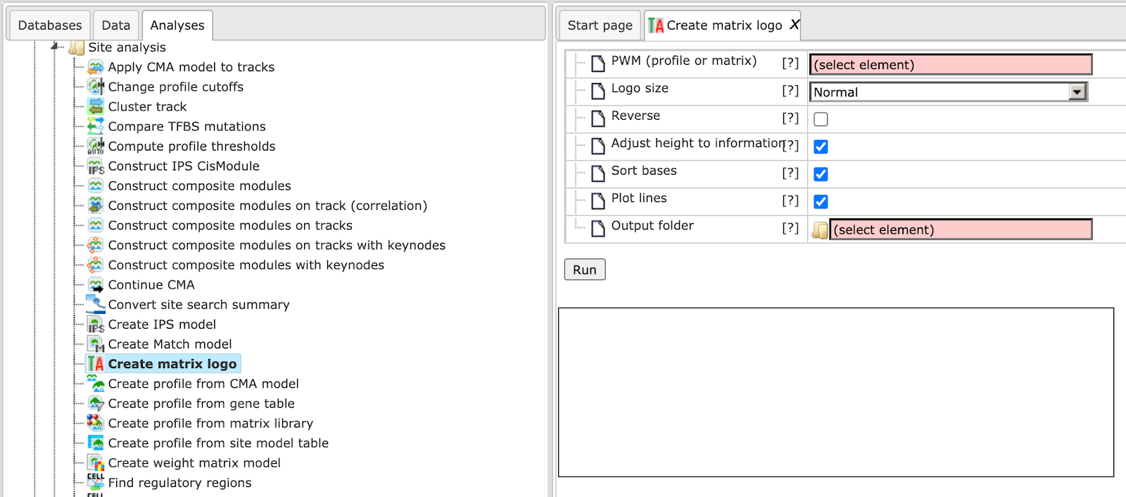
Each individual parameter is described below:
PWM (profile or matrix) – Specify the input profile or a single matrix. You can drag it from your project within the tree area and drop it in the pink box of the field PWM. Alternatively, you may click on the pink field “select element” and a new window will be opened, where you can select the input gene set as shown below.
Logo size – The method gives an option to select one of four different sizes for the Matrix logo image. It ranges from small to extra-large.
Reverse – Check this box to create logos for the reverse orientation. By default this box is unchecked.
Adjust height to information – Check this box to adjust total height of bases to information content of position.
Sort bases – Check this box to sort bases, the most important on top.
Plot lines – Checked this box to draw lines behind bases partitioning plot region into four sections.
Output folder – Specify the name and path of the output folder for the created logos.
Keeping all other parameters as default, the method runs as shown below:
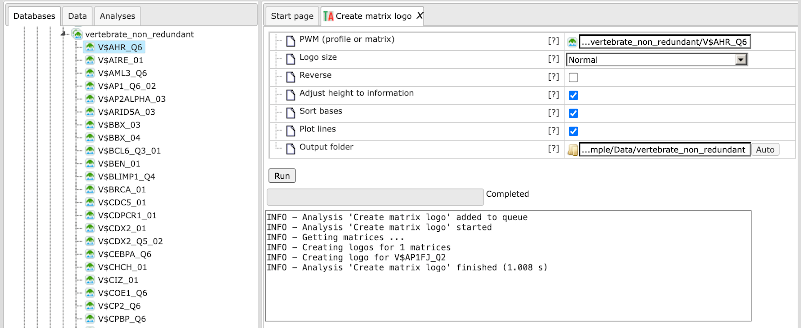
The output folder contains one PNG image for each matrix of the specified input. Existing files in the output folder are not overwritten. In case of name conflicts the tool suffixes a number to the file name as shown below:
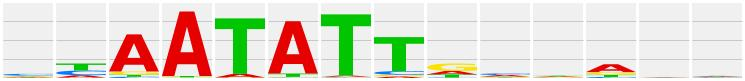
The matrix logo output image is as shown below:
Each matrix image can be exported in either .jpeg, .png, or .bmp file formats using the ‘Export document’ button.
Identify enriched TF sites in promoters
Version 2.0 (Adjusted p-values)
TRANSFAC®
This workflow is designed to find individual motifs enriched in the promoters of
the input gene set as compared with a background set (No set). In the first part
of the workflow, the enriched motifs are identified by the method
analyses/Methods/Site analysis/Search for enriched TFBSs (genes), (
Please refer to individual methods description for details on this particular analysis method.
Filtered enriched motifs serve as a basis to construct a specific profile, and this profile is run on the promoters of the input gene set, method analyses/Methods/Site analysis/Site search on gene set, (
To launch the workflow, follow these steps:
Step 1 Open the workflow input form from the Start page. It will open in the main Work Space and looks as shown below:
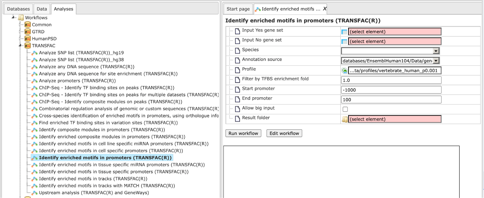
Step 2 Input the Yes set from the tree. You can either drag-and-drop or select the Yes set from the Tree area. Here, the set of up-regulated genes from the following Examples folder is used:
The Yes set in this example contains 125 genes up-regulated in human liver cells treated with interferon-γ (IFNγ) as compared with non-treated cells.
Step 3 Similarly input the NO set from the tree area. By default the workflow uses a subset of 300 genes randomly taken out of the human housekeeping genes. The default NO set can be found here:
Step 4 Select the profile. This profile will be applied at the first part of the workflow for identification of the enriched motifs. The default profile is vertebrate_human_p0.001 from the most recent TRANSFAC® release available. It can be found here:
The number of matrices in the profile shown here is 5114
Any other TRANSFAC® profile or user-specific profile can be selected. With a mouse click on the field Profile, a pop-up window will open, where a profile can be selected.
Step 5 After input of the Yes and No sets, the species (human, mouse or rat) is adjusted automatically. Verify the species shown in the species field.
Step 6 Filter by TFBS enrichment fold: In this field you can specify the enrichment fold (FE) to filter the motifs. By default it is 1.0, which means all motifs with FE>1.0 will be reported in the resulting table and the same motifs will serve to create a specific profile. If you want to use highly-enriched motifs, you can specify higher thresholds, e.g. 1.1, 1.2 etc, or even 2.0 or 3.0 depending on your Yes and No sets. It is recommended that you run it with default parameters first, check the results, and then run again with the desired filter value.
Step 7 Specify the promoter region relative to TSS as they are annotated in Ensembl. The default promoter region is -1000 to +100 relative to the TSS. You can edit the fields Start promoter and End promoter as required.
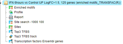
Step 8 Specify the result folder location and name and Press the button [Run workflow]. Wait till the workflow is completed.
Results
The results folder consists of several files and folders as shown below:
The table Enriched Motifs ( ) contains those site models, here TRANSFAC® matrices, which are enriched in the Yes set in comparison with the No set as shown below:
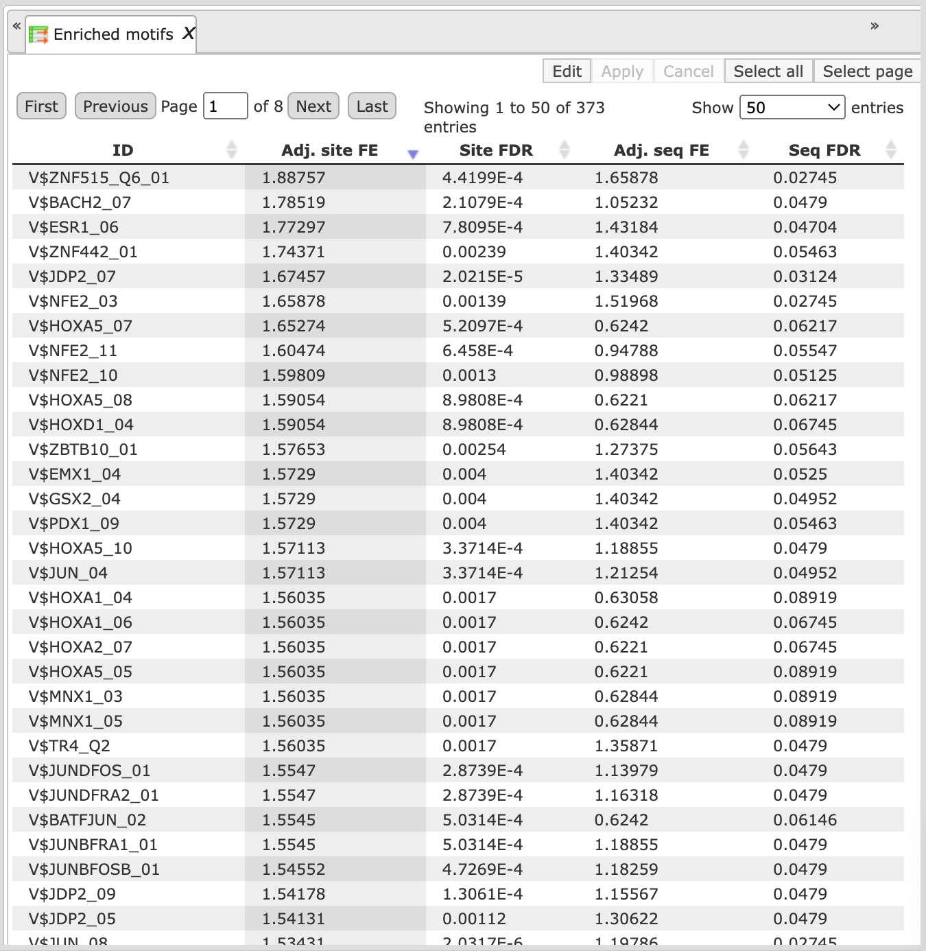
Each row of the output table represents the result for one PWM from the input profile. Only those PWMs with adj. site FE >1 are included in the output. For details on the output columns please refer to section 20.1.4.1. Recommended sorting, as shown on the screenshot above, is by column Adj. site FE (adjusted fold enrichment for sites) with the highest values on top.
Please note that out of 5114 matrices in the initial profile, hits for 796 matrices are enriched with adj. site FE >1. These matrices are considered to create profiles specific for the input Yes and No sets.
Motifs for IRF, STAT, ICSBP transcription factors are highly enriched, with adj. site FE >2, as shown in the screenshot above. This is a very relevant result considering that here the effect of IFNγ on liver cells is studied.
The table Profile ( ) presents details for PWMs with adj. site FE >1.
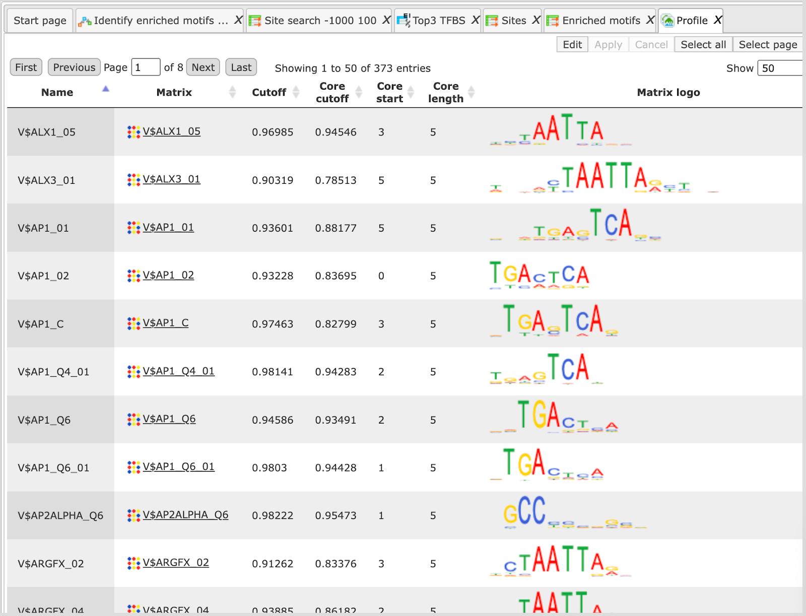
This profile is an intermediate result of the workflow and is used further for Site search on gene set analysis.
Site search analysis output ( ) serves to visualize enriched motifs in the promoters. This folder contains four tracks (
 ):
):
Each track can be opened in the genome browser by double-clicking. A visualization of the track yes sites is shown below:
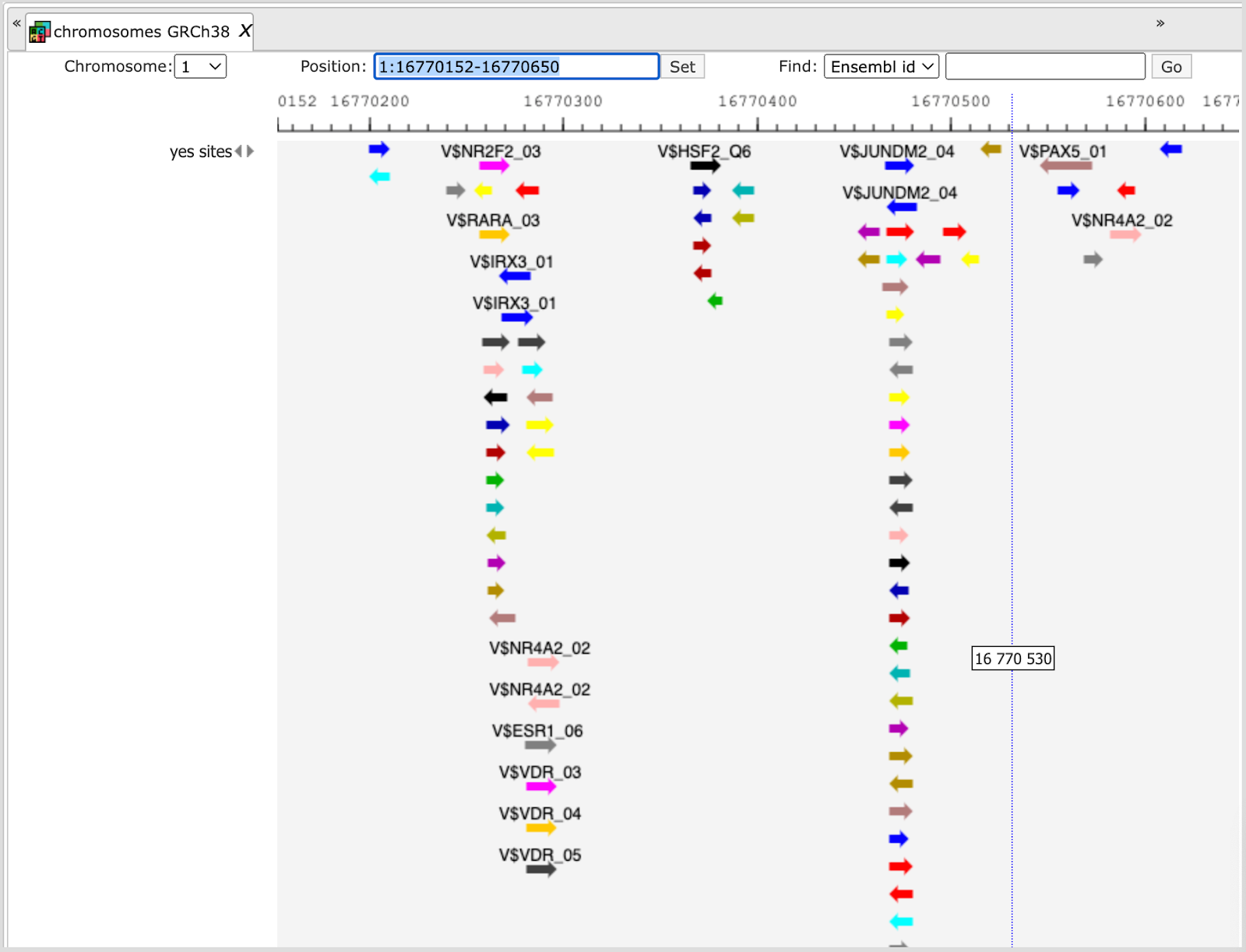
The same track can be opened as a table; for this use right mouse click on the track name in the tree area or Ctrl +mouse click for Mac users.
With the same menu, you can apply other functions to the selected track, e.g. export it in available formats or delete.
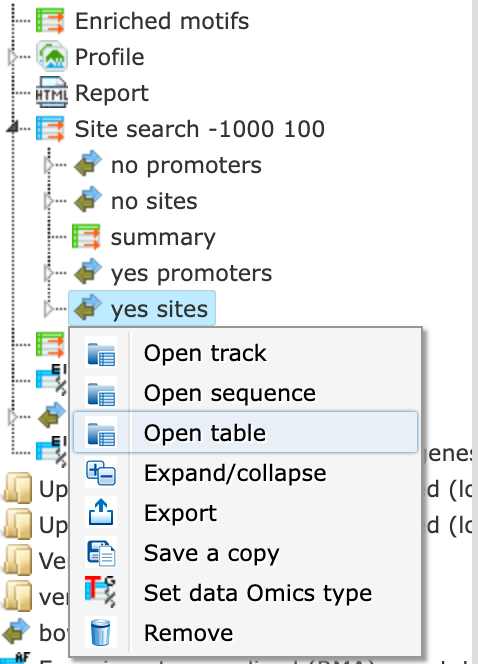
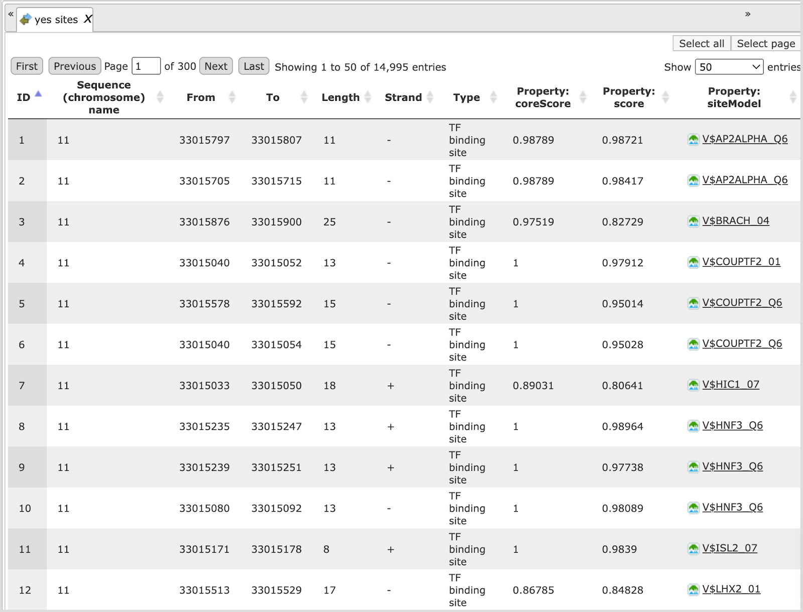
Table view on the track yes sites is the following:
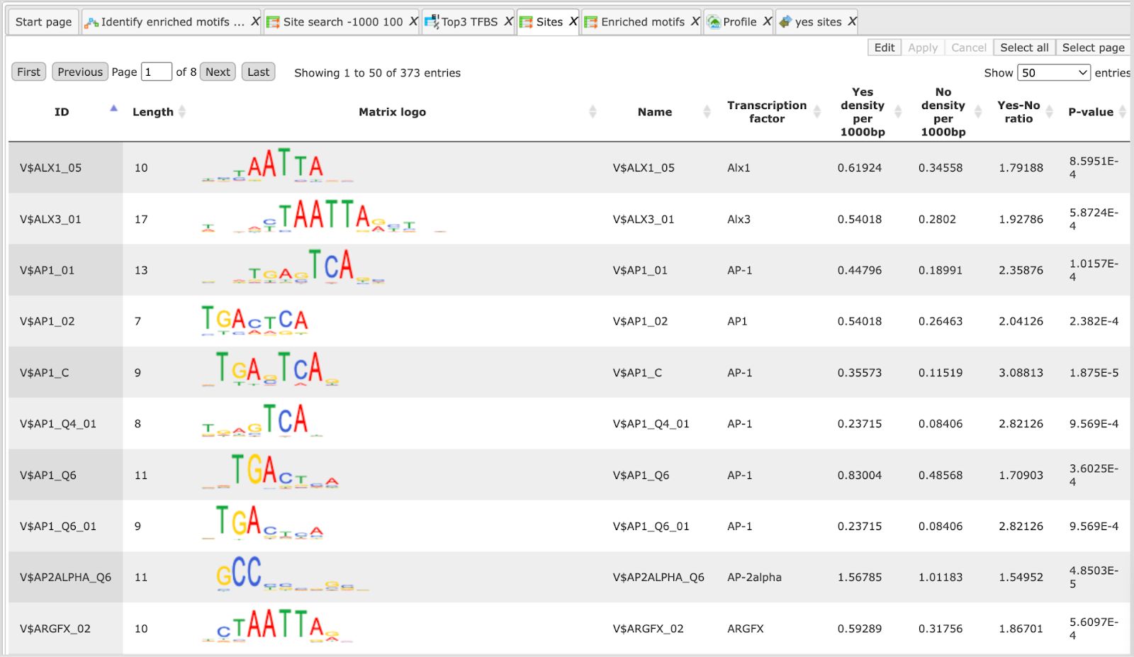
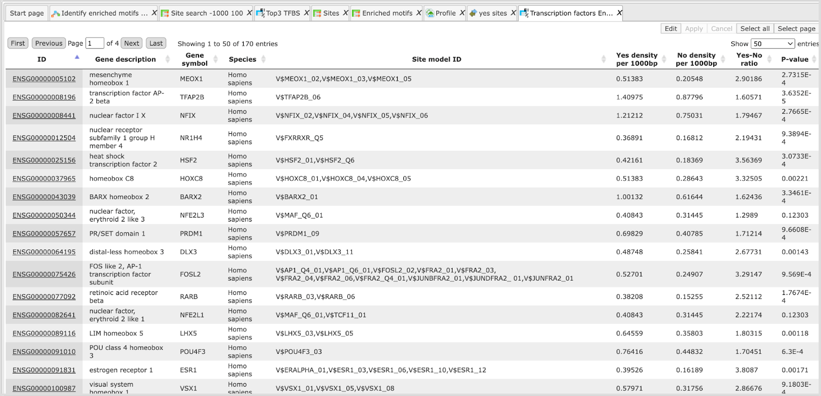
Sites table ( )gives the list of Transcription Factor matrices linked to the enriched motifs.
For Each Transcription factor Yes-No ratio is calculated along with the P-value
and Matrix logo. Detailed report on selected matrices can be obtained while
selecting each transcription factor and pressing the report on selected matrices
button (
)gives the list of Transcription Factor matrices linked to the enriched motifs.
For Each Transcription factor Yes-No ratio is calculated along with the P-value
and Matrix logo. Detailed report on selected matrices can be obtained while
selecting each transcription factor and pressing the report on selected matrices
button ( ) on the control panel.
The output table TOP 3 TFBS ( ) gives the binding site, and
binding positions of top three transcription factors enriched in the promoters.
) gives the binding site, and
binding positions of top three transcription factors enriched in the promoters.
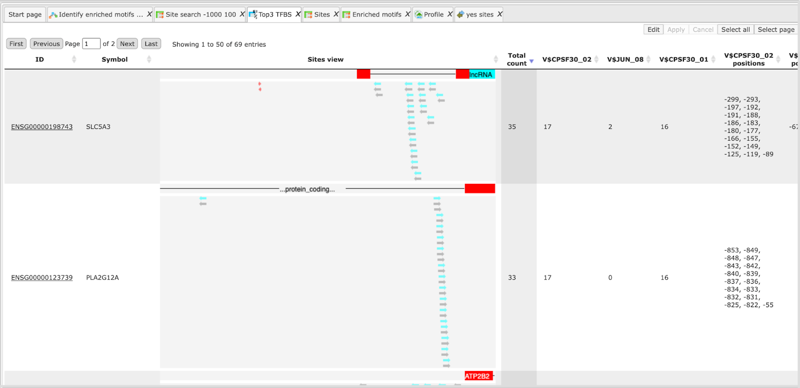
This table can be further annotated to add a column with expression values, as shown below.
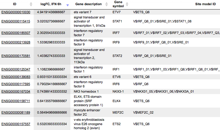
Twelve TFs are found to be highly up-regulated under the same conditions, all members of Ets, STAT, IRF, MEF2 families. The role of these TFs in regulation of the input Yes genes is suggested by two independent lines of evidence: first, genes encoding these TFs are highly up-regulated, and second, their binding motifs are significantly enriched in the promoters of Yes genes.
A HTML report is generated at the end that summarizes the workflow results in a page as shown below:
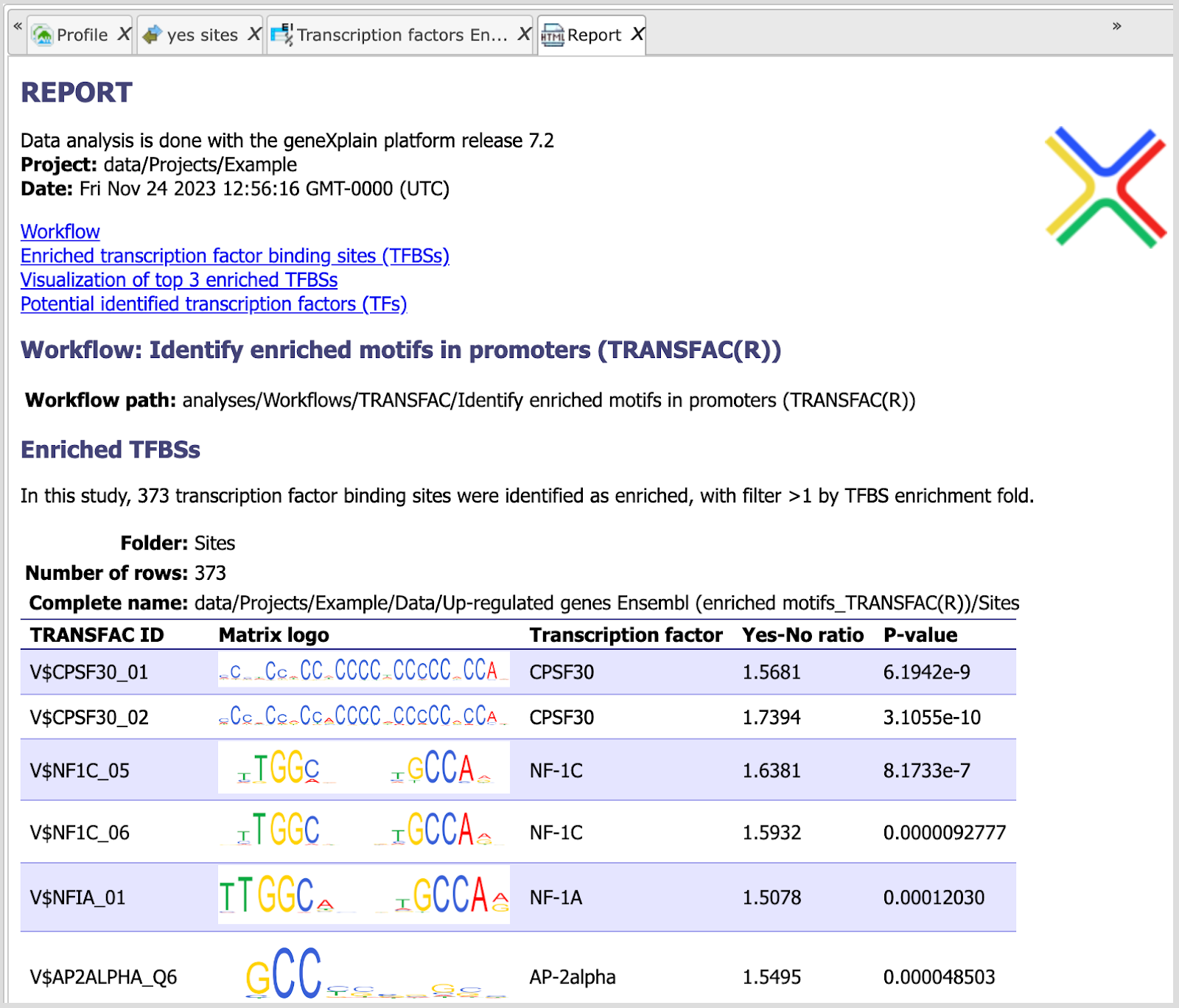
This report can be exported in HTML format for further use.
Note This workflow is available together with a valid TRANSFAC® license.
Please, feel free to ask for details (info@genexplain.com).
GTRD
This workflow is designed to search for putative transcription factor binding sites, TFBS, in the promoters of an input gene set. It is very similar to the workflow described above in Section 10.4. The only difference is in the PWM library applied. Here, site search is done with the help of the GTRD library
For the input form and description of the results folder, please refer to the description of the workflow Analyze Regulatory regions
Version 1.2 (Classical)
TRANSFAC®
This workflow is designed to search for putative transcription factor binding sites, TFBS, in the promoters of an input gene set. Site search is done with the help of the TRANSFAC® library of positional weight matrices, PWMs, namely with the profile vertebrate_non_redundant_minSUM.
To launch the workflow, follow these steps:
Step 1 Open the workflow input form from the Start page. It will open in the main Work Space and looks as shown below:
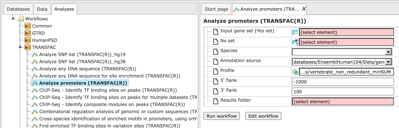
Step 2 Specify input gene or protein set in the field Input gene set.
The input table contains the genes under study, and it is also called the ‘Yes’
set. To specify a gene set, you can drag & drop it from your project within the
Tree Area, and drop it in the pink box of the field Input gene set.
Alternatively, you may click on the pink field “select element”, and a new
window will open, where you can select the input gene set as shown below. After
you have selected the gene set, press [Ok].
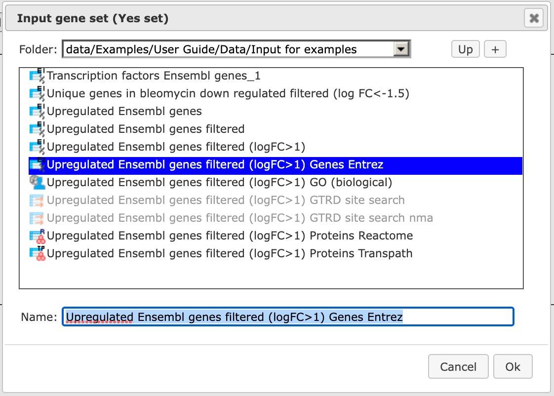
Step 3 Specify the biological species of the input set in the field Species by selecting the required species from the drop-down menu.
Step 4 Define where the folder with the results should be located in the tree. You can do so by clicking on the pink field “select element” in the field Results folder, and a new window will open where you can select the location of the results folder and define its name as shown below.
Step 5. Press the [Run workflow] button.
Wait until the workflow is completed, which is shown below:
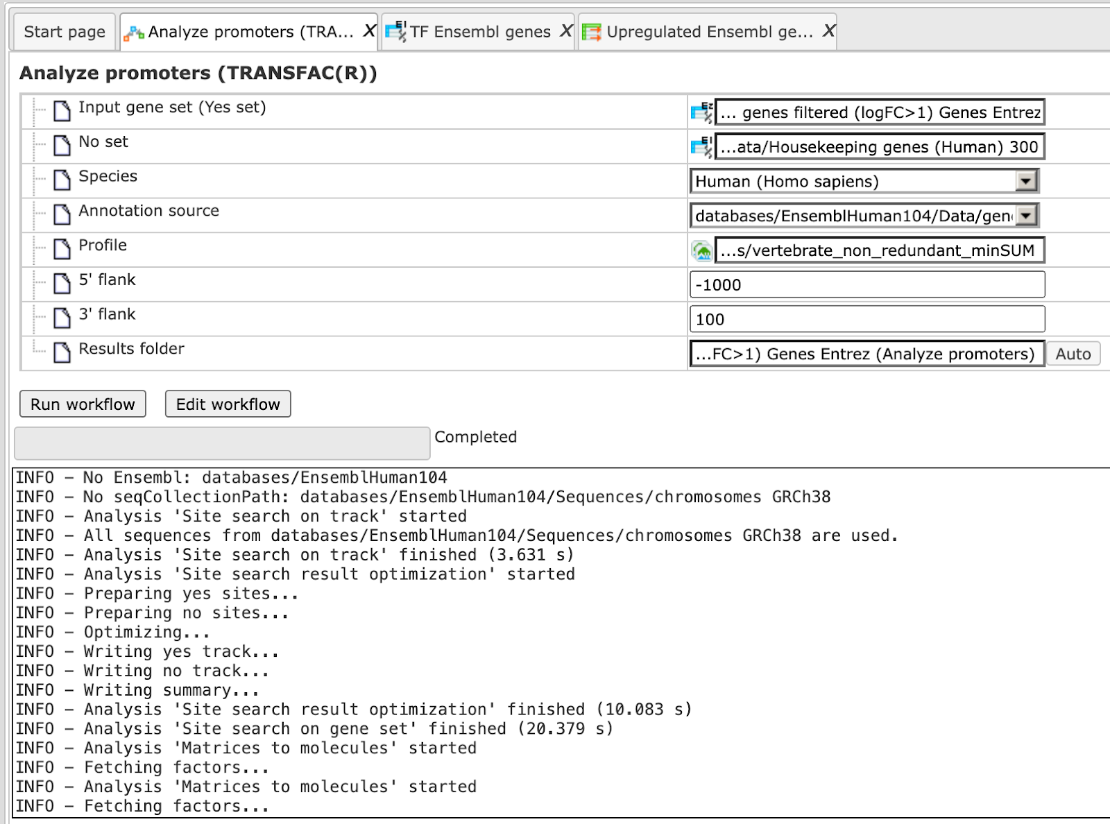
The results folder contains next files:
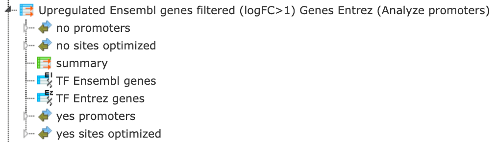
The tables called summary ( ), TF Ensembl genes, and TF Entrez genes
are opened automatically in the work area as soon as the workflow is completed.
), TF Ensembl genes, and TF Entrez genes
are opened automatically in the work area as soon as the workflow is completed.
Tip You can easily create a similar workflow with parameter values adjusted to your needs. For example, you can select another profile from the list of available TRANSFAC® profiles, or specify different promoter positions relative to the TSS (default is -1000 to +100).
To do this, you need first to open the workflow in the “Edit workflow” mode, and save a copy in your project area. The [Edit workflow] button is located near the button [Run workflow] (see above, Step 1). Upon clicking on [Edit workflow], the workflow diagram will open in the Work Space, and you can select one of the analyses you would like to modify. For the screenshot below the “Site search on gene set” analysis was selected, and in the Operations Field, on the tab “Workflow”, all the parameters are visible. Under this mode, you can either check what the default parameters are, or modify them according to your needs.
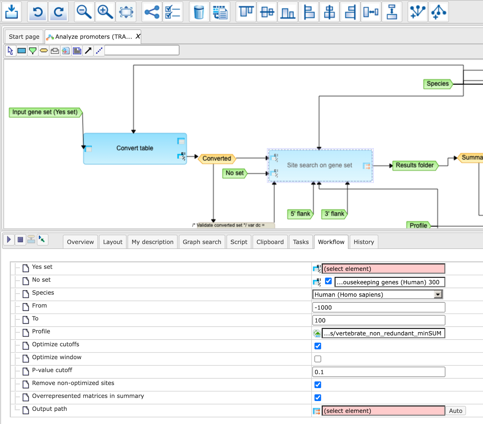
Note This workflow is available together with a valid TRANSFAC® license.
Please, feel free to ask for details (info@genexplain.com).
GTRD
This workflow is designed to search for putative transcription factor binding sites, TFBS, in the promoters of an input gene set. It is very similar to the workflow described above using the TRANSFAC(R) database. The only difference is in the PWM library applied. Here, site search is done with the help of the GTRD library
For the input form and description of the results folder, please refer to the description above.
Identify composite modules in promoters
Version 2.0 (Adjusted p-values) with TRANSFAC®
This workflow is designed to find pairs of sites in the promoters of the input gene set. This workflow enables the identification of combinations of several enriched TFBSs in the promoters of the genes under study (Yes-set). The resulting composite module differentiates the Yes-set from a background set (No-set).
In the first part of the workflow, the enriched motifs are identified by the
method analyses/Methods/Site analysis/Search for enriched TFBSs (genes) ()
Please refer to the individual analysis method description for the method search for enriched TFBSs.
Motifs with an enrichment of >1.0 fold serve as a basis for constructing a
specific profile, and this profile is run on the promoters of the input gene
set, method analyses/Methods/Site analysis/Site search on gene set ()
In the second part of this workflow, composite modules are identified based on the enriched TFBSs. For more details about CMA analysis refer to indiviual method description.
To launch the workflow, follow these steps:
Step 1 Open the workflow input form from the Start page. It will open in the main Work Space and looks as shown below:
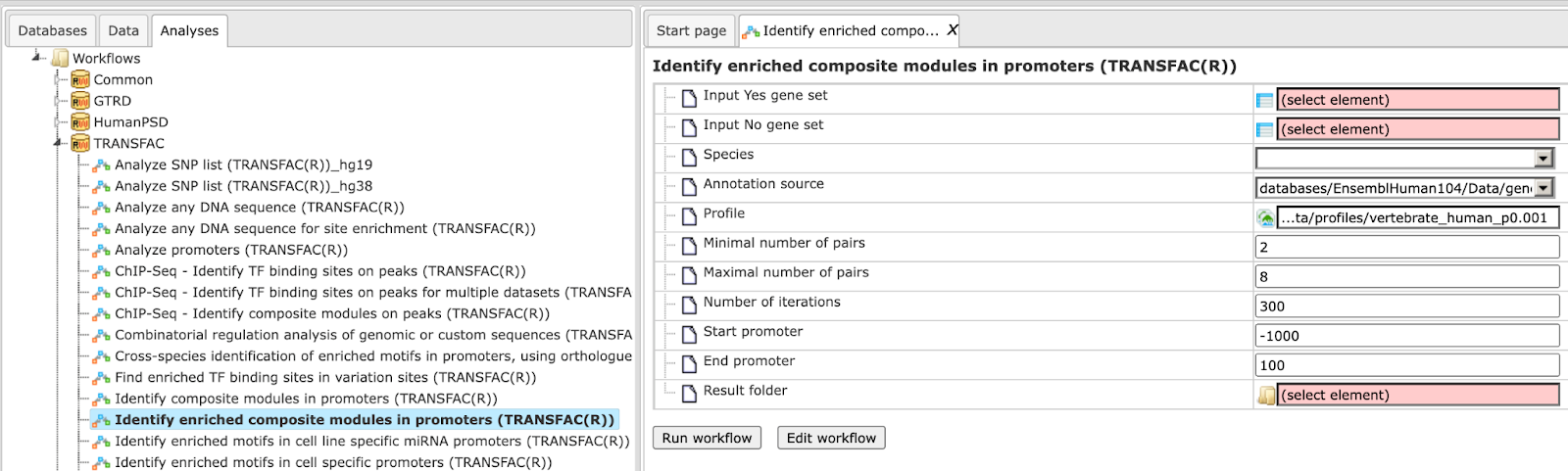
Step 2 Input the Yes set from the tree. You can either drag-and-drop or select the Yes set from the Tree area. Here, the set of up-regulated genes from the following Examples folder is used:
The Yes set in this example contains 125 genes up-regulated in human liver cells treated with interferon-γ (IFNγ) as compared with non-treated cells.
Step 3 Similarly input the NO set from the tree area. By default the workflow uses a subset of 300 genes randomly taken out of the human housekeeping genes.
Step 4 After input of the Yes and No sets, the species (human, mouse or rat) is adjusted automatically. Verify the species shown in the species field.
Step 5 Select the profile. The selected profile will be applied at the first part of the workflow for identification of enriched motifs. The default profile is vertebrate_human_p0.001 from the most recent TRANSFAC® release available. Any other TRANSFAC® profile or user-specific profile can be chosen. With a mouse click on the field Profile, a pop-up window will open, where a profile can be selected. The number of matrices in the default profile, which is used here, is 4961.
Step 6 Set up parameters for the composite module search. This workflow identifies pairs of sites. By default, the minimum and maximum numbers of pairs are given as 2 and 8. You can change these parameters according to the number of pairs you aim to identify. The number of iterations of the genetic algorithm is 300 by default, and can be adapted as required.
Step 7 Specify the promoter region relative to TSS as they are annotated in Ensembl. The default promoter region is -1000 to +100 relative to the TSS. You can edit the fields Start promoter and End promoter as required.
Step 8 Specify the result folder location and name and Press the button [Run workflow]. Wait till the workflow is completed.
Note This workflow may take more time depending on the size of the Yes and No sets and on the number of iterations. The recommended size of the Yes set is 150 genes maximum, and the recommended size of the No set is 300 genes maximum. The maximum recommended number of iterations is 300.
Results The results folder consists of several folders and files as shown below and can be accessed using the path
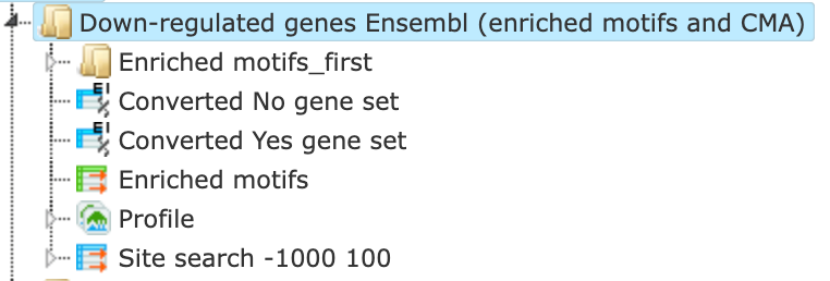
The table Enriched Motifs () contains those site models,
here TRANSFAC® matrices, which are enriched in the Yes set as compared to the No set as shown below.
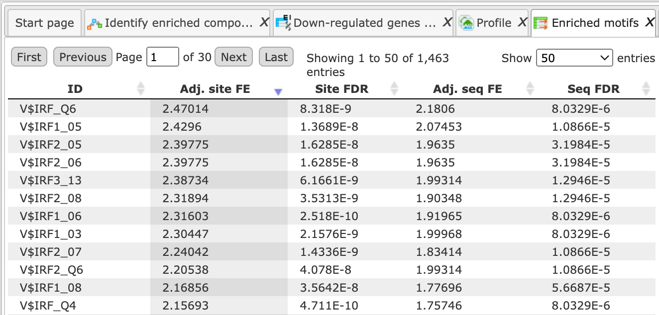
Each row of the output table represents the result for one PWM from the input profile. Only those PWMs with adj. site FE >1 are included in the output. For details on the output columns please refer to section 9.5.1. Recommended sorting, as shown in the screenshot above, is done by highest Adj. site FE (adjusted fold enrichment for sites).
Please note that out of 4961 matrices in the initial profile, hits for 773 matrices are enriched with adj. site FE >1. These matrices are considered to create profiles specific for the input Yes and No sets.
Motifs for IRF, ISRE, ICSBP transcription factors are highly enriched, with adj. site FE >2, as shown in the screenshot above. This is a very relevant result considering that here the effect of IFNγ on liver cells is studied.
The table Profile () presents details for PWMs with adj. site FE >1.
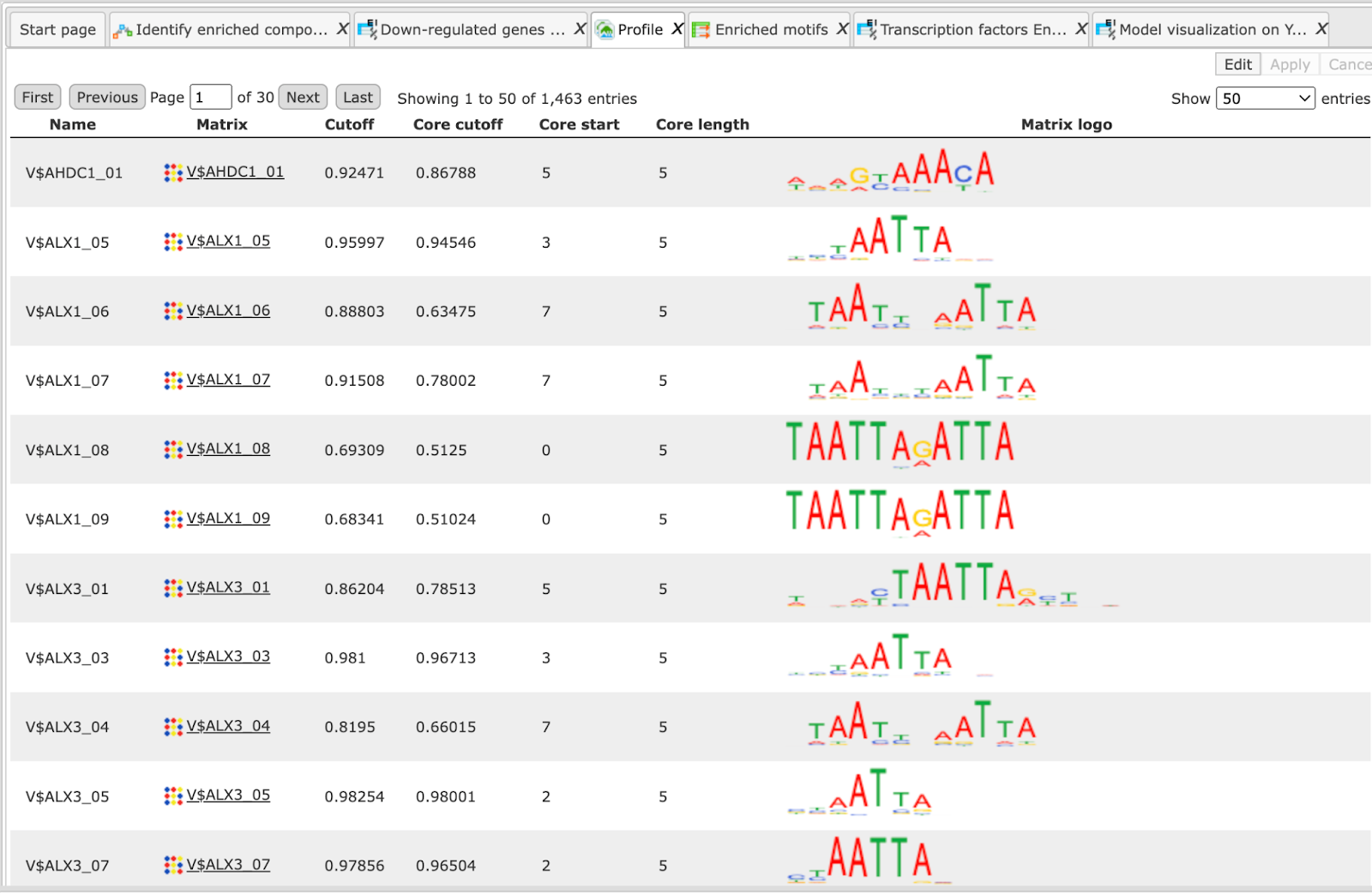
This profile is an intermediate result of the workflow, and it is used further for Site search on gene set analysis.
Site search analysis output () is an intermediate result of the workflow, and its results are used further for the identification of composite modules. Details about the individual output files in this folder can be found in individual method description.
The Modules folder ( ) is a result of the analysis Construct composite modules. It contains two tables, two tracks, one histogram, and one model view as shown below:
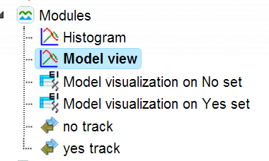
The Model View is a graphical summary for the hierarchically organized composite elements generated as a result of the CMA analysis. As mentioned above, this workflow is designed to identify pairs of sites, and we asked to identify 2 to 6 pairs. The Model view presents four pairs, and we can see by exactly which site models (matrices) these pairs are formed as well as statistical parameters of the overall model.
Each track can be opened in the genome browser by double-clicking. Visualization of the composite modules on the promoter of ISG15, one of the Yes set genes, is shown below.
For more details on the individual output tables and tracks as well as for visualization of the identified composite modules in the genome browser please refer to indiviual method description.
The output table Transcription factors Ensembl genes () is a
list of transcription factors linked to the site models in the composite module identified by the workflow.
For each transcription factor, the Ensembl gene ID is provided, as well as a gene description, the HGNC gene symbol,
species, and site model (TRANSFAC® PWM name).
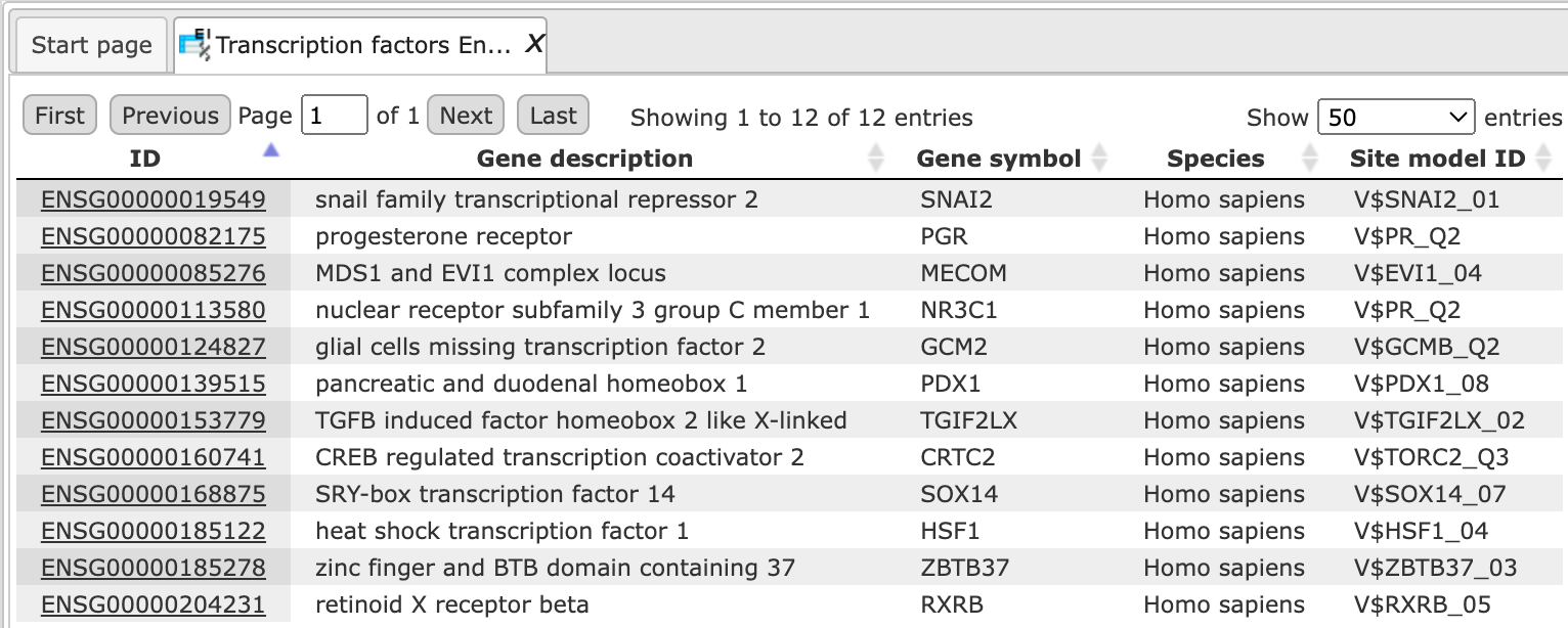
Seventeen transcription factors shown in the table above are candidate regulators of genes in the input Yes set. They are suggested to regulate transcription of Yes-genes via the identified composite elements. This table can be further annotated to add a column with expression values, as shown below. Details for annotation of the tables are given in the description of the Annotate table.
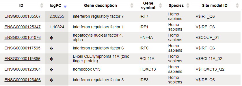
Three TFs are found to be highly up-regulated under the same conditions, IRF1, 6 and 7. The role of these TFs in regulation of the input Yes genes is suggested by two independent lines of evidence: genes encoding these TFs are highly up-regulated, and their motifs are parts of the identified enriched composite modules.
Note*.* This workflow is available together with a valid TRANSFAC® license.
Please, feel free to ask for details (info@genexplain.com).
Cross-species identification of enriched motifs in promoters using ortholog information (TRANSFAC®)
This workflow is designed to find individual motifs enriched in the promoters of the input gene set as compared with a background set (No set). It is very similar to the workflow described above except that here you can use an input table for any species and get the output for the desired species.
The workflow is found here:
In the first part of the workflow, enriched motifs are identified by the method
analyses/Methods/Site analysis/Search for enriched TFBSs (genes) ( )
)
Please refer to details on this particular analysis method. Filtered enriched motifs serve as a basis to construct a specific profile, and this profile is applied to the promoters of the input gene set, method analyses/Methods/Site analysis/Site search on gene set. The last step is a conversion to homology transcription factors.
The input form looks as shown below:
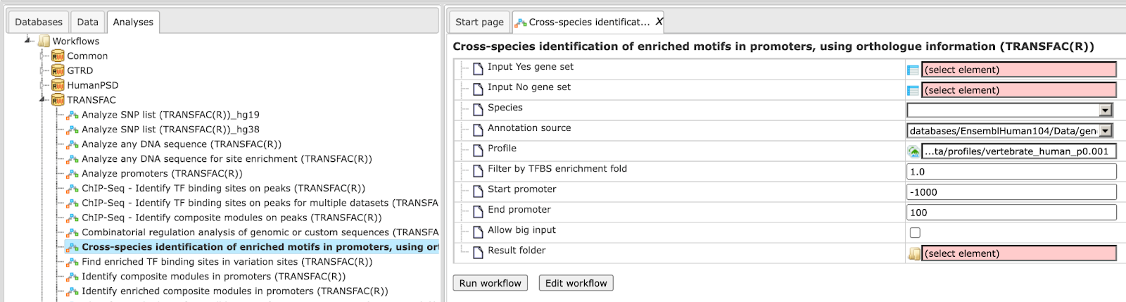
Step 1 Select an Input Yes gene set from the tree. You can either drag-and-drop or select the Yes set from the Tree area.
The set of up-regulated genes used in this Example can be found here:
Step 2 Specify the Species of the input set and the Species of the output set. In this case Input is Mouse and Output species selected is human.
Step 3 Select Input No gene set from the tree area. By default, the workflow uses a subset from 300 genes randomly taken out of the human housekeeping genes.
For this example the NO set used is:
Step 4 The profile will be applied in the first part of the workflow for the identification of enriched motifs. The default profile is vertebrate_human_p0.001 from the most recent TRANSFAC® release available. Any other TRANSFAC® profile or user-specific profile can be selected. With a mouse click on the field Profile, a pop-up window will open, where a profile can be selected.
Step 5 Filter by TFBS enrichment fold: In this field you can specify the enrichment fold (FE) to filter the motifs. By default, it is 1.0, which means all motifs with FE>1.0 will be reported in the resulting table and the same motifs will serve to create a specific profile. If you want to use highly-enriched motifs, you can specify higher thresholds, e.g. 1.1, 1.2 etc., or even 2.0 or 3.0 depending on your Yes and No sets. It is recommended that you run it with default parameters first, check the results, and then repeat with the desired filter value.
Step 6 Specify the promoter region relative to TSS as they are annotated in Ensembl. The default promoter region is -1000 to +100 relative to the TSS. You can edit the fields Start promoter and End promoter as required.
Step 7 Specify the Result folder location and name and Press the button [Run workflow]. Wait till the workflow is completed.
The result folder consists of several files is found here:
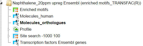
The table Enriched Motifs ( ) contains those site models,
here TRANSFAC® matrices, which are enriched in the Yes set in comparison with the No set.
) contains those site models,
here TRANSFAC® matrices, which are enriched in the Yes set in comparison with the No set.
The table Molecules Orthologs have a list of molecules from the input gene set with their site search results as shown below:
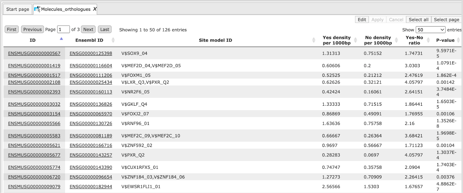
Every gene is linked to the corresponding matrix molecule by the Yes-No ratio.
The table Molecules_human contains the site models of the converted input table. In this case the output species is Human hence this table is Molecules_human with mapping to human Ensembl genes with corresponding matrices. If the output species is mouse, then this table will have mouse Ensembl genes.
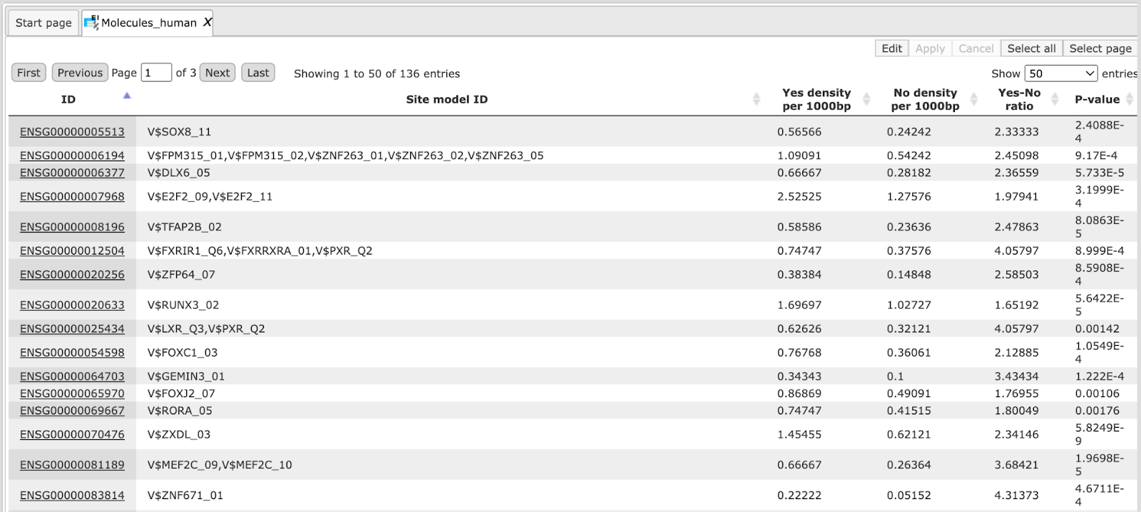
The output table Transcription factors Ensembl genes is a list of transcription factors linked to the enriched motifs. For each transcription factor, the Ensembl gene ID is provided, as well as gene description, HGNC gene symbol, species, and site model (TRANSFAC® PWM name). This table can be further annotated to add a column with expression values, as shown below. Details for annotation of the tables are given in the section Annotate table
Visualization of site search results
This method visualizes results of the site search analyses. It can be found
under the tab Analyses, in the folder Methods/Site analysis/Site search report
( ). Here the default input form is shown:
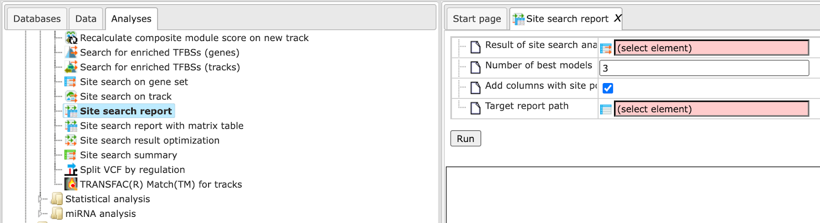
In the following, we will consider the input fields one by one.
Result of site search analysis. You can drag & drop the site search result (must contain summary table with p-value column) from your project within the tree area. Alternatively, you may click on the pink field “select element”, and a new window will open, where you select the site search result. After having selected the result, press the [Ok] button.
For this example, all further steps are demonstrated on the following input set found here:
Number of best models. Choose the number of best models (according to p-value) to include in the report. The default value are the three top models.
Add columns with site positions. If you are interested in the promoter positions of the single sites, please check the appropriate box.
Target report path. Define where the table with the results should be located in your project tree. You can do so by clicking on the pink box (select element) in the field, and a new window will open, where you can select the location of the resulting table and define its name.
Press the [Run] button and wait until the method is completed. The result opens automatically and looks like this:
Can be accessed using the URL:
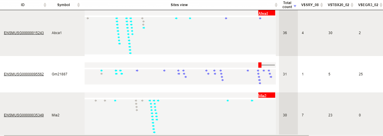
We see a visualization of two promoters from the genes Abca1, Gm2887, and mia2. The TSS is on the right side, where the blue box is located. All arrows are identified sites of the best models and marked with different colors. Also the orientation of the individual sites is shown by the arrow head. The number Total count gives the number of all sites according to the three best models. The numbers of sites for every model (1-3) are given in the next three columns. As an example, model V$TBX20_02 finds 30 sites in the promoter of Abca1. The column V$TBX20_02 positions contains all single site positions for the first model in the promoter of Abca1, e.g. -516 from TSS.